|
Painting subject: camel train Following an art demonstration that Jake Winkle gave to Lacock Art Group last year we were keen for him to return to run an all-day watercolour workshop and secured the date of Saturday 25 Jan for exactly that. Our all-day workshops are reserved only for members of Lacock Art Group, with places offered on a first come/first served basis due to space limitations. All 16 places were taken quickly, making it a full house. Workshop materials Jake’s go-to watercolour paper is Arches rough,140lbs, which he prefers to use because it offers good absorbency and dries evenly. However, a good quality watercolour paper like Arches is expensive so it’s worthwhile shopping around various art supply websites in search of the best price. You can often find it on special offer. He advises stretching the paper first, to avoid cockling (bending) when it gets very wet and to help prevent the paint from puddling and/or creating cauliflowers. Jake’s tried and tested method for stretching paper is to put a sheet of in a bath tub of water and let it soak for one minute. Then remove the paper and leave it for 5-10 minutes to expand and then dry. When it’s ready to use, fix the sheet of paper to a board using gum tape (not the self-adhesive paper tape for sealing the reverse of picture frames) on all four sides. You could also use masking tape but this tends to become loose and peel off if it gets too wet. Palettes, paints and brushes
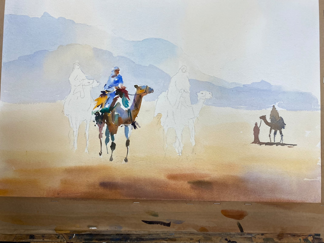
Workshop Jake explained that the aim of this workshop was to achieve a light touch, loose, simple style. By simple he means no details, impressionistic. The subject is a desert scene of a camel train, with hills in the distant background. As the focus of the workshop was on painting rather than drawing, to save time, he provided us with a template of the drawing to trace onto our own paper. At every step in the process Jake demonstrated the technique to attendees before letting us loose on the painting. Then while we got on with it, he walked around to each person to see how they were doing, offering advice and answering questions along the way, which was really helpful. Sky and foreground - initial wash He asked us to wet the paper with water first using a large brush - buying time to put the wash on, Jake assures us. Having already mixed up a pool of pale, watery cobalt blue we applied it at the top of the paper in long, light strokes, alternating the blue patches with a watery, yellowy orange colour (raw sienna or yellow ochre). We took this variegated wash down to the bottom of the mountain range.
With the paper still damp, we move on to the sand, starting at the bottom and working quickly, wet into wet, putting the orange colour on first (using light red or similar, with raw sienna/yellow ochre) making the wash paler and yellow as it moves up towards the base of the mountains. While it’s still wet, go in with a stronger, more intense orange/brown col in the foreground, darkening it with ultramarine blue and splashes of purple if we liked. Ensure that the top colour is stickier in consistency than the colour of the layer below it. Mountains Jake guides us through putting a slightly stronger wash of cobalt blue on the far distant hill again alternating with orange/yellow to create the sun’s glow, stopping just above the top line of the second, mid-distant mountain. The initial wash had to be dry before applying the next layer. A slightly darker cobalt blue with a tiny dab of alizarin crimson goes on this second mountain, as well as the orange/yellow colour. Camels The smallest camel on the right of the painting is a silhouette, using a neutral, darkish colour (such as sepia, or ultramarine blue and burnt sienna). Next the focus is on the middle camel in the main group of three, painting the rider first. Jake shows us how to approach this, by using fragmented brush strokes – breaking up the marks and leaving parts of the paper white. The approach also suggests detail using gestures (e.g. riders’ hands and faces, using sticky light red), and encourages us not to copy the colours of the reference photo but to try to use other colours like blues, yellows, purples.
We use cobalt blue, orange and yellow or red for the camel’s body and a neutral blue grey colour on the legs. Jake urges us to leave gaps between the camel’s leg joints rather than paint the legs with one continuous brush stroke as this adds interest. Using a similar approach we then paint the camel on the far left before tackling the one on the far right of the group, completing the trio.
To finish off Jake showed us how to paint the shadows of the camels, which helps to ground the animals in the painting. He makes a sticky mix of cobalt blue, light red or alizarin crimson and paints in the shadow, which falls in a left to right direction. The last word Everyone attending Jake’s workshop thoroughly enjoyed themselves. It was highly informative, good-humoured, and everyone pitched in regardless of their experience with watercolour. Massive thanks to Jake for his patience on the day, and for showing us a range of techniques that we can take forwards into our future paintings. To see the paintings produced by attendees during the workshop please go to the 2025 Jake Winkle workshop gallery. Thank you for reading.
0 Comments
Painting a contemporary landscape in watercolour Our next art demonstration on 20 February features well-known, Berkshire-based artist, Elizabeth Baldin, who will focus on her approach to painting watercolour landscapes. This takes place at Lacock Village Hall and replaces our usual Thursday night session.
 To find out more about Elizabeth Baldin and her work please take a look at her website.
See you at the demo! Festive Frolics and rounding off 2024 Each December we hold an art challenge for members to take part in if they wish to, with a different theme each time and the emphasis on this being a fun initiative. For the 2024 challenge we returned to a previous theme: to paint a portrait of a member of LAG from a reference photo, in a style and medium of the artist’s choice. LAG’s chair, Joy Tickell, randomly allocated a subject to each member of the group taking part and to inject an element of intrigue and surprise into the challenge each artist kept the identity of their subject under wraps/a secret until unveiled on judging night. This proved to be a challenge in itself for some! Thirty members took part in the challenge, producing portraits in oils, acrylics, watercolours, pastels, and graphite. Judging took place during our ‘frolics’ evening (traditionally the last session of the year in December) when all members attending were each invited to cast one vote for their favourite portrait to determine the winner. LAG chair, Joy Tickell, says: “It was brilliant to see so many of the group getting involved in this year’s challenge. What’s more, the standard of the artwork submitted was incredibly high, especially given the fact that many of our members rarely paint portraits and for some this was a first. I’d like to thank everyone who took part and for the time and effort you put into your portraits for the challenge.” When everyone had voted two portraits tied with six votes each. These were Glyn Overton’s painting of Angie Weir and Graham Brewster’s of Dave Cooper. It was extremely hard to vote for one painting only because there were so many great portraits that deserved recognition. Paintings that also received votes in the first voting round were Elspeth Wales’ portrait of Tracy Warne, which got four votes, and Dani French’s painting of Sally Grogan received three votes. Several other paintings received one vote each, including (in no particular order):
Challenge winner However, we needed an outright winner. The tension mounted as we held a second round of voting between the two paintings that received six votes in the first round. So, without further ado, after a second voting round, Glyn Overton emerged the clear winner with her fantastic painting of Angie Weir in acrylics that captured Angie’s likeness and personality perfectly. Many congratulations to Glyn for her win, which was thoroughly deserved. Do look at all the portrait entries along with corresponding reference photos in the new Winter 2024 Art Challenge gallery.
Rounding off 2024 - two new honorary members Our last meeting of the year is called the ‘frolics’ evening. The term ‘frolics’ suggests the evening is more risqué than it actually is but is usually a lot of fun, and involves festive nibbles to eat, contributed by members, some sort of game, plus any ad hoc announcements. The frolics event was the ideal opportunity for Joy (chair) to announce two new honorary members – John Harris and Anna Swatton who both joined LAG 36 years ago. Joy announced the good news and presented them each with a bottle of champagne, thanking them for their unstinting involvement in and commitment to LAG for so many years. To finish off the frolics, we formed teams and played a round of two of Beetle Drive, which brought out the competitive nature in some!  Two new honorary members. John Harris (L), chair Joy Tickell (c), and Anna Swatton (R) Christmas social In December we held a meal for members at La Flambé, returning there by popular demand. Huge thanks to Tracy Warne for once again organising the meal (and us), which was attended by 27 of us and proved to be a very enjoyable occasion. The restaurant staff did us proud – everyone agreed that the food was fabulous and plentiful, the service was spot on, and conversation flowed. Here are a few photos from the evening.
Demo date: Thursday 28 November Join us for our last art demonstration of the year, which is being given by Bristol-based painter, Tom Hughes. An important part of Tom's approach to painting is to work outside on location "en plein air" initially, making small studies in oils, observing and capturing the light, texture and hues, developing the work back in the studio. He paints a range of subjects such as woods, street scenes in London, Bristol and Bath, and beach huts. Demo venue: Lacock Village Hall, East Street, Lacock SN15 2LF Time: 7pm prompt to 9pm Guests welcome - £5 entry fee per person on the door.  Coming soon to Lacock - weekend of 16-17 November As ever, Lacock Art Group's next exhibition features the work of many of its members whose art covers a wide range of subjects painted with oils, acrylics, pastels and watercolour. There's sure to be something to suit everyone's tastes.
Please come and see us and our art - we look forward to seeing you over the exhibition weekend.  Next LAG demo - Thursday 31 October Our next demo takes place at the end of October, on Halloween night. It will be an evening full of treats and no tricks. Professional artist Colin Ross Jack will demonstrate his approach to making art with pastels. You can find out more about his work by visiting his website. Guests are welcome to attend - there's no need to book a place in advance. There is a £5 entry fee for visitors, payable on arrival. We look forward to seeing you at the demo. Details are below:  How it works, details and dates This year our Christmas competition takes the theme of portraits - of our art group members. As usual, this is intended to be a fun competition for members to take part in if they wish to. That said, if previous such challenges are anything to go by, the competition is likely to be pretty fierce! To help members prepare and keep track, here are the essential details and dates to be aware of. Details:
Dates:
Previous portrait competitions We last held this theme in the autumn of 2018, judged at the Christmas Frolics event. Here are a few photos taken of the entries to give newer members an idea of what to expect. Several members have left LAG since 2018 so you may not recognise some of the portraits - no reflection on the likeness of any paintings themselves! The winning portrait was of Margaret Gray, painted by Mark Peskett (former member and previous LAG chair). Apologies for the photo quality, which was affected in places by glare.   The winning portrait of Margaret Gray is the large painting in the centre of the top row.   Demo sheds light on the painter’s technique and approach David Cobley is an English portrait and figure painter, best known for his oil paintings of famous people including actors, royalty, broadcasters, and leaders of large institutions. Luckily for us, David lives in Wiltshire and this demo came about by chance when one of our members, Ken Baldy, attended a talk David gave to a local business group about his life and work. Chatting after the talk Ken asked about doing a demo for us. And the rest, as the saying goes, is history. Held on 5 September at Lacock Village Hall, this demo is our best-attended in recent years, if not ever. The chance to see a painter of such calibre at work proved highly appealing. With about 40 people present, including some visitors, we ran out of chairs so for a few it was standing room only. The aim of the demo was for David to paint a portrait of a ‘live’ sitter, who we could choose, and show how he approaches his craft. Given that Ken instigated the demo it was only fitting that he was David’s muse for the session. David started the demo with a question for the audience; what did we want him to cover during the session? His technique and thinking, was the answer. Equipment With Ken in position sitting on a chair on the hall’s stage, a pale gold curtain as backdrop, and David all set up, he quickly explained about the kit he’s using:
Initial marks He pre-paints a canvas usually with a neutral, greeny blue background, saying that this is partly so as not to feel daunted by a white canvas and it gives a tone to work into. He explains he thinks more in tone than in colour, and this background is 3-4 on the tonal scale where 1 is white and 10 black. David starts the painting by making black marks on the canvas to indicate the position and tonal value of the eyes, nose and mouth, followed by white marks on the forehead, also for tonal purposes. He mixes Prussian Blue (PB) with Venetian Red (VR) to make a darkish grey and advises people to use bigger brushes than you think you need, for faster coverage. Impatient by nature, says David, he likes to see quick results when he paints. The first marks made on the canvas are really important, he says.
As he’s never painted Ken before, he doesn’t know what his head looks like so he explores it first. He explains that if this was a normal sitting he would have done some sketches beforehand for exploration. Next he starts thinking about Ken’s head, neck and shoulders and makes a rough outline on the canvas. He also pointed out that, while painting, he constantly flicks his eyes quickly from Ken to canvas and back again, and constantly adjusts the drawing as he goes. He tells us that he has a life size skull at home so is very aware of bone structure and how the flesh falls on a face.  Fleshing out Having got the outline down, David changes the paint to Yellow Ochre (YO). He’s now thinking about the contrast of Ken’s pale blue shirt against the warmth of his face and the greeny/blue background so puts YO on the background. For the forehead skin colours he uses a warmer blue than PB, Ultramarine Blue (UMB) and a different brush for each pigment to avoid muddying the colours. Tonally, the forehead is 3 on the scale, he informs us – an overhead light shines on it. He reminds us that the head is asymmetrical so he tends to paint one feature (such as an ear) on one side of the head and checks the corresponding feature on the other side of the face straight away, for accuracy.
As he was making adjustments David remarked matter-of-factly that Ken’s neck is thin. Ken retorted, “Well, it’s been wrung a few times!” The audience chuckled loudly, enjoying the banter. Ken pointed out that he’d noticed the high degree of concentration on David’s face when he looks at Ken and back to the canvas. Someone commented that he hadn’t done much to the eyes but nevertheless the likeness is there, just as they are. The best advice he says he’s ever been given came from his school art teacher. He told him to paint what you see, leave your preconceptions at the door. David says he’s conscious the painting looks a mess at this stage, so tries to ignore the messy start and reassure himself that he’s done this before; it will be OK. He need not have worried. Within a mere 20 minutes of starting the painting he had captured a distinct likeness and the essence of Ken.  20 minutes in and the essence of Ken is caught on canvas Further refinement After a short tea break we resume. So far he’s used PB, YO, VR for this painting. Responding to a question from the audience about preferred colours, he says he uses PB and VR a lot, but apart from those doesn’t have a standard set of colours as such. Always aware of complementary colours he tries to bring them out in his work, with this painting the colours are orange and blue. Although working from a photo of a subject can sometimes be helpful David says there’s no substitute for a sitting with the person. In portraits you’re trying to create the illusion of a 3D object in space, using pigment and brushes. That’s hard to do from a photo because it’s a flat, 1D surface. Talking as he works, David explains that he’s trying to suggest Ken’s neck is dipping into the collar. More friendly banter ensues. Ken: “Do I look like a tortoise to you?” David: “I think I need my lawyer!” “You’re coming out of your shell, Ken,” quips someone in the audience. As well as painting people David says he loves to get out into countryside and paint the lovely landscape of Wiltshire. He also likes to think, and be controversial in his paintings. Now that he adds more detail and refines the painting he uses thicker paint, which you tend to do as a painting progresses. He adds that using paint straight out of the tube is probably the best approach from a permanence standpoint as it has been mixed specially for this purpose. Asked how to avoid over working or flattening out when painting from a photo, he replies, “Good question. I suppose it’s experience, knowing when to stop.” The session went in a flash and suddenly it was 9pm, time to stop. Feedback from attendees was overwhelmingly positive, saying the demo was “superb”, “amazing”, “fantastic”, “great to listen to – gave us factual information but didn’t overdo it”, “a privilege”, “incredible and inspiring”. Our thanks to David for making it such an enjoyable and interesting evening, and to the art group members who helped to make it all run so smoothly on the night. David spent another hour and a half on the painting the following day; his final version is below. It's interesting to see that the relatively small tweaks and refinements at this stage make such a major difference overall. The painting will soon adorn a wall in Ken’s house, if it doesn't already.
David's Devizes exhibition starts soon
David is exhibiting in Devizes, at the White Chalk Gallery, 5 Old Swan Yard, SN10 1AT, from 17 Sept – 5 Oct 2024, Tuesday to Saturday, 10am to 5pm. Called Traces, the exhibition also features ceramics by Janene Waudby. More information is available on David’s website, where you can also buy a copy of his book, All by Himself. It’s a fascinating read, discussing his artistic influences and putting his work into an art historical context by charting his work through key stages of his career. A chance to enter your art into two major local art exhibitions
40th anniversary of the demolition of the Harris factory, Calne This year is also the 40th anniversary of the demolition of the C&T Harris bacon factory, which dominated Calne's town centre for many years and was its biggest employer. To mark this anniversary the Festival is holding a community art project, inviting people to buy and decorate one of 500 papier mache pigs. This has been under way all summer, creating a great deal of engagement from people and some impressively themed and painted piglets. A selection of the piglets will be included in an exhibition at the Calne Heritage Centre throughout October, alongside exhibits charting the history of the factory and what it was like to work there. CMAF art exhibition - key submission dates and information
Oexmann Art Award & Exhibition, Devizes Held every two years, the main purpose of this event is to encourage and promote Wiltshire artists - who are born or live in the county. Wiltshire Museum organises and holds the exhibition in Devizes home, which includes selected entries and is open to the public from 19 October to 23 November, 2024. Key facts
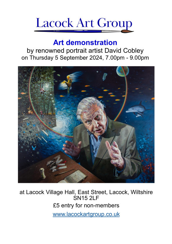
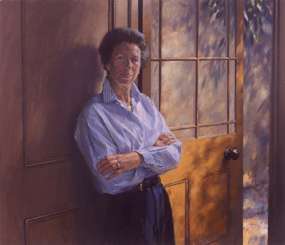
 Join us on Thursday evening, 5 September at Lacock Village Hall This chance to see well-known Wiltshire artist, David Cobley, at work is one that's not to be missed! David, one of England's foremost portrait and figure painter, will be painting a portrait in oils, working with a live model on the night, explaining and demonstrating his approach. He has been commissioned to paint many famous personalities during his career including comedian Ken Dodd (a remarkable painting of reflections now hanging in the National Portrait Gallery), broadcaster Sir David Attenborough to mark his 96th year, The Princess Royal, and artist David Hockney, as well as lesser-known people. He is driven by his fascination with the way human beings think, move and behave. His book, All by Himself, discusses his artistic influences and charts his career is well-worth reading. To learn more about David and his work, please visit his website. Here are a few of his portaits, provided by David and including a self-portrait. Details of the demo are on the poster shown.
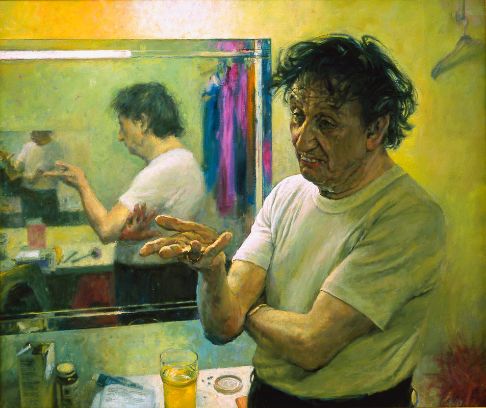 Ken Dodd |
WelcomeRead about our latest activities and initiatives here! Archives
February 2025
Categories
All
|
- Home
-
Galleries
- Workshops >
- Challenges >
-
Members' Galleries
>
- Richard Adams
- Ken Baldy
- Keith Bennet
- Graham Brewster
- Victoria Cleverly
- Sarah Clover
- Dave Cooper
- Chris Crosby
- Margaret Gray
- John Harris
- Jacqui Matthews
- Vanda McCann
- Graeme McFaull
- Karen McGreevy
- Glyn Overton
- Sally Parsons
- Linda Ridler
- Karen Road
- Kay Smith
- Joy Tickell
- Jane Tucker
- Elspeth Wales
- Tracy Warne aka Maggie
- Angela Weir Martin
- Mike Wilson
- Exhibitions
- News/Blog
- Membership
- Events
- Contact


 RSS Feed
Site powered by Weebly. Managed by netnerd.com