|
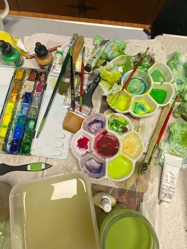
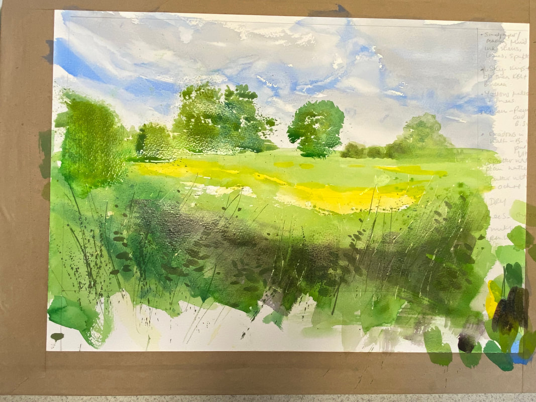
A look back at Kate Wade’s demo for Lacock Art Group Kate is a Wiltshire based landscape artist who specialises in watercolour and gouache, and who also uses acrylic inks, acrylics and oils in her paintings to convey certain characteristics to best effect. She finds inspiration for her work from nature, the countryside and coast, which offer a never-ending variation of colours, patterns and textures through the four seasons. You can see Kate’s work in an exhibition at The Corsham Gallery, in Corsham, Wiltshire, until 28 August. We were very pleased to welcome Kate at the end of May to give an insight into her approach to painting along with some tips about how to apply her technique into our own artwork. Kate used a reference photo taken of Avebury earlier in May, which Kate calls the ‘fluffy month in the countryside. The scene is of distant trees and hedgerows, beyond a bright yellow field in the middle ground, and a dense bank of foliage (grasses, nettles, cow parsley) in the foreground. Her style is very loose and tends to feature fresh, bright colours. Getting started Her ‘go to’ paper is 300g/m2 Bockingford stretched NOT (cold pressed) paper. For the demo Kate uses half a full sheet of this paper, taped to a board. She prefers Jackson’s Art Supplies own brand paint of watercolour paint or Windsor & Newton’s Professional series, and tends to use flat paint brushes. Kate starts off by drawing a light sketch, placing the horizon centrally on the paper – there are no rules, she says. Initially she focuses on the foreground, aiming to put texture here, using masking fluid to block off twigs and other foliage, preparing the base for further layers of paint to give the impression of masses of leaves. Next she spatters masking fluid with an old toothbrush, using a very light touch. Trying not to overdo the cow parsley. The applicator for the masking fluid (which has a small pipette able to mask off quite fine lines) is from Jackson’s Art. After this she moves to the sky and before approaching the bottom half of the painting.
Sky and foreground Tackling the sky is always a bit scary, acknowledged Kate; it was comforting to hear that even accomplished, professional artists also find this rather daunting at times. Using a range of different blues, beginning with Cobalt Blue for the stream of blue sky among the clouds, followed by Kings Blue Light, Kate then adds another shade of blue. She softens the edges of the clouds for variation and darkens this with Burnt Sienna, running it into the Cobalt and dabbing with tissue paper to soften it. Generally Kate paints her skies wet on dry, preferring a bit more control over the paint than you get with wet on wet. Now Kate moves to work on the foreground, putting in some acrylic ink, which is waterproof, to represent grasses and leaves. She builds up foliage of nettles etc in layers, making grassy lines with a rigger brush, getting movement into them, mixing Yellow Ochre with Emerald Green. Using a small squirrel mop she makes nettle shapes on the grass before laying a wash.
Fields and distant trees Kate next turns her attention to the fields in the middle ground of the composition, first applying yellow, the lighter, brighter colour, to avoid it getting lost. Starting with Cad Yellow Light plus a bit of Indian Yellow (a very intense colour) out of tube to warm it up. She takes yellow over the grassy areas as the undertone and adds yellow to where trees will be on the horizon to give them a little light. Permanent Green, knocked back with Yellow Ochre, keeps this area sunlit and bright while a ground of green will blend in with trees when they’re painted. She uses a bigger brush for the foreground colours that are more saturated and spatters paint to distract eye from hard edges. When this is dry, she paints a layer on top adding Cerulean Blue to the green to exaggerate reality slightly. Once the sky is dry Kate starts work on trees. She spatters and stipples the paint to achieve the effect of soft, fluffy edges on the trees. Getting the right shade of green can be tricky, says Kate, and Hookers Green is an option. For the smaller trees, Kate uses a round brush to blob the paint on, adding a darker colour in middle of the tree. Here, granulation of paint enhances the effect. She adds a tiny bit of French Ultramarine to darken the green further. Foreground depth, finishing off Kate decides to put shadow undertones into the foreground to the bottom half of the painting. To do this she mixes Burnt Umber and Quinacridone Purple, creating a clear, nice dark. Using a big flat brush she paints it across the foreground noting that it may look drastically dark, but the paint sinks in and you can put more colour over the top. Next Kate adds more green to the foreground shadow, keeping the green bright but tempering it with Burnt Sienna. The more opaque the colour the more it sits forward in the painting so she recommends using it to your advantage.
The final step is to rub off the masking fluid from the foreground, applied at the outset, to create the grasses. Kate adds more detail with thick Yellow Ochre mixed with white gouache. She also use gouache to create white or pale highlights. Creating the effect of cow parsley is laborious takes time to do, but is worth the effort. To do this Kate uses cotton buds to spatter gouache, a creamy white colour mixed dirty water.  Final painting, showing greater definition of distant trees and foreground depth and detail With grateful thanks to Kate for an inspirational, enjoyable and educational demo.
0 Comments
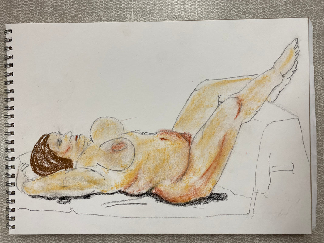
A summary of the art produced during this special session Occasionally we hold life drawing sessions for our member artists to take part in if they wish, with the latest one held towards the end of July. Experienced life drawing model, Loz, sat for a variety of timed poses: 5 x 2 minute poses; 2 x 5 mins; 2 x 10 mins; 1 x 15 mins; and 1 x 25 mins. Loz was brilliant, holding a range of poses, standing, seated, and lying down. The high speed sketches were a particular challenge to draw, causing the brains of one or two of us to freeze in sheer panic at the prospect! It was hugely enjoyable, highly intense, and a valuable exercise. Here are a selection of our drawings. On behalf of everyone who took part in this session, we extend our thanks to Loz for her professionalism and patience. 5 and 10 minute poses
15 min poses
25 min pose
Takes place on Sat, Sun, Mon 24, 25, 26 August, featuring artwork produced by members of Lacock Art Group
Profits donated to Lacock Primary School  It may feel like summer has only just arrived in the UK yet we are already approaching the half-way mark, and before we know it the countdown to 2025 will begin! Time to get organised and ahead of the game. We’ve produced the Lacock Art Group 2025 Wall Calendar, featuring paintings produced by some of our members, which is now available to buy, priced at £10 per calendar. We are very happy to announce that we will donate all profits from calendar sales to Lacock Primary School, which is located in the village where we hold our weekly art group meetings. If you buy one of our calendars not only will you have some lovely art images to look at in your home but you will also be supporting a very worthwhile cause. Plus, the calendars make excellent, practical and appealing gifts.
About our calendar The calendar is double A4 in size when open and hung up, with a feature painting on the top page and the relevant month’s dates on the bottom page. Each dates page includes a handy section for writing additional notes and reminders. How to buy a LAG 2025 calendar You can buy copies of our 2025 calendar at our August and November exhibitions as well as at forthcoming demos, while stocks last. Our next demo is at the end of October. Details of future exhibitions and demos are on the events page of this website. Alternatively you can request to buy copies by sending an email to: [email protected] and we will post calendars to you upon receipt of payment. Please include in your email:
Postage & Packaging All calendars come in a protective cellophane wrapper. Calendars despatched by post fit into Royal Mail’s large letter category, and we will post them in cardboard envelopes. This incurs an additional charge for postage and packaging of £2.80 (including the cost of the board envelope). Up to three calendars will fit into a cardboard envelope. How we selected the calendar images We invited all members to submit up to two images of their paintings for our committee members to consider. We received a great response and are grateful to everyone who took part. In the interests of fairness, we felt it was important to use a methodology for selecting the calendar images. So we asked committee members to choose their 12 preferred options plus two reserves, from the submissions. We collated their choices and ranked the images according to the number of ‘votes’ the paintings received, selecting the final 12 on this basis. To keep the process simple and speedy, our Chair, Joy Tickell, allocated paintings to months – some, of course, were self-selecting due to the subject. Joy asked committee member, Elspeth Wales (who co-ordinated the calendar’s production), to choose the cover painting, which she selected because it's eye-catching and general in its appeal. We wanted to offer as wide a representation of artwork as possible so we decided that each artist would only have one of their paintings included in the calendar. To see other artwork created by members please take a moment to look at their personal galleries on this website. There were a couple of requirements for submissions to meet, such as images/paintings had to be landscape in orientation and meet a minimum file size. We hope you find our calendar useful and would like to thank you, in advance, for supporting this project.
REMINDER: takes place on Thursday 30 May at Lacock Village Hall, 7pm. Guests are welcome - no need to pre-book attendance. Pay on arrival. We are looking forward to welcoming local Wiltshire artist, Kate Wade, for her first demonstration to members and guests of Lacock Art Group. Kate is a contemporary landscape painter who works predominantly in waterolour and gouache. To find out more about Kate and what inspires her work please visit her website, where you can also see some of her brilliant art.  Featuring our members' artworks, takes place on Sat/Sun 18-19 May
Demonstration review Watercolourist Jake Winkle, who’s known for his bold, loose and lively style, returned to Lacock Art Group towards the end of March to demonstrate his approach to painting wild animals. Before going any further, apologies to Jake for borrowing the title of one of his DVDs in the headline of this blog post. ‘Going Wild in Watercolour' is also the title of one of his art workshops at the White Horse Bookshop in Marlborough on 22 May. Jake previously demonstrated his method to LAG in about 2016, and he remembered one or two members who had evidently made a lasting impression on him! This time around Jake created two paintings during the demo; a pair of otters were the main feature, followed by a quicker painting of a cockerel. Equipment To start with Jake gave a brief explanation about his preferred painting kit, as follows. Paper He uses Arches watercolour paper, rough, 140lb/300g/m2 because it absorbs water quickly and evenly, allowing the paint to bed into the surface of the paper in a consistent way. He also stretches the paper to prevent it cockling when applying very wet washes. The paper then tightens up again when the paint is dry. Palette Jake used a portable palette for the demonstration, although a white dinner plate does a sufficient job if you have nothing else – the base of the plate provides a big enough surface to mix paints while the rim holds blobs of paint. He said it’s important to keep the mixing space of your palette away from paint itself so that it doesn’t become contaminated. Easel His easel is home-made, portable and built to his specification, with all the key features positioned exactly where he needs them to be.
Paint As he is a colourist Jake, uses secondary colours straight out of tube rather than mixing them to achieve greater intensity of colour. Using the full range of tones and colours is key to his style. The brands he tends to use are Winsor & Newton (W&N) plus a couple of Daler Rowney colours. He uses these brands partly because they are what he started with but also because, in his view, some of the other brands aren’t as thick as W&N out of tube. This is important for his style of painting, which involves applying dark colours straight away, rather than the more traditional approach of building up depth of colour in layers. Brushes Jake recommends using hair (sable) brushes because they create a clearer wash, and hold about three times the volume of water than synthetic brushes. With watercolour, he explained that for optimum results it’s essential to touch the paper with the brush as little as possible. Practice, practice, practice It gets complex when combining all the basic techniques of watercolours so he advises learning how to use watercolours through a lot of practice, to the point where it becomes second nature: you know how the paper reacts to and absorbs water; you can anticipate what happens when wet paint hits wet paper; how watery or thick the paint needs to be, and so on. Only when you are fully familiar with how watercolour behaves can you begin to consider your own artistic interpretation of the subject, which is what makes your art different to others. Painting 1: Otters
Second otter The second otter, on the right of the picture, is very pale, providing contrast. Jake explains that paintings need busyness and quietness, achieved with tonal differences. Instead of grey, he puts in a combination of blue and crimson, wet into wet, to add depth. Spattering paint helps break up patterns and shapes, but also can help bring together the object and background. Making the whiskers overlap onto the second otter also helps to connect the pair. The background is a pale, delicate wash of cobalt blue, a dominant colour in the rest of the painting, helps to unify it and also helps to reveal the otters’ edges. Jake also discussed how he fragments, or breaks up, the image to simplify it, adding that the key to simplification is, in fact, understatement not omission. Find a way to understate the image, not omit elements because that can change the scene, making it unrecognisable. Understatement can be delivered through reduction – reducing lots of small shapes into larger ones by connecting them together, often by tone, and by merging shapes together with soft, blurred edges. 
Painting 2: cockerel This was a very quick, gestural painting.
Wrapping up It was a pleasure to welcome Jake back to LAG to show his approach. His demo not only proved to be inspirational for the 30 or so members and guests who attended, it also provoked some lively, good natured and amusing discussion from one of our more provocative members on the topic of sustainable art materials! Overall, this demo was tremendous fun, informal yet most informative.  If you’re interested in finding out more about Jake’s work please visit his website where you can also find details of the workshops and online tutorials he offers.
An introduction to oil painting by Melissa Wishart One Saturday in mid-February, 17 of our members took part in a day-long workshop all about oil painting, delivered by well-known Wiltshire artist, Melissa Wishart. These workshops are exclusively for Lacock Art Group members and it’s great to have expert artists/tutors like Melissa giving us their undivided attention to help us learn and improve our art. Melissa’s workshop was the first one featuring the use of oils. Several attendees have considerable experience of painting with oils while others’ experience of the medium is limited to non-existent, so a few of us approached the day with some trepidation! We needn’t have worried; Melissa pitched the tone perfectly for all levels of experience, with good humour, knowledge, and a relaxed, guiding hand. To find out more about Melissa’s art and background please visit her website. In addition to this blog post about the workshop, please take a look at the Oils Workshop gallery page to see more images from the day.
First steps and fundamentals Melissa started us off on the fundamentals of oil paint, and surface; paint brands to use, canvas vs boards, and went on to talk about dilutants (to thin the paint), and techniques like glazing (transparent layers of paint that reflect light). Other tips include:
Exercise 1 – palette preparation and colour mixing Melissa explained that with oils, the bulk of the work of a painting happens on the palette, through colour mixing, and recapped on warm and cool colours (warm = red, orange, yellow, cold = green, blue, magenta). Our first task was to lay out a palette, putting large blobs of paint around the edge of the palette in a circle, following the colour wheel sequence: Titanium White, Lemon Yellow (for brighter greens), Cadmium Yellow Deep, Yellow Ochre, Cadmium Red, Burnt Sienna, Ultramarine Blue (aka French Ultramarine), Burnt Umber, and Cerulean Blue. Using a palette knife (not a brush), in the middle of the palette we mixed a large amount of grey, either from Ultramarine, Burnt Umber and White, or from black and white. This grey, which Melissa calls her ‘mothership’, forms the basis of all mid-tones. We then put blobs of grey around the palette and mixed them with a spot of each colour to mute them. A palette knife is easier for mixing as you can simply wipe it clean with a rag. It’s important not to contaminate different colours on the brush because you tend to end up with muddy colours.
Composition essentials Having sorted out our palettes ready for action, the workshop moved to the topic of composition. Careful planning here is key – this applies to all drawing/painting not just oil painting, of course. We would be painting a landscape or a seascape during the workshop, a scene of our own choice. Melissa suggested using a viewfinder to select the section of the reference picture that interests you most. For a painting to be successful it’s crucial for the artist to have an emotional connection with the subject matter. Our tutor guided us through a number of decisions that need making, in particular:
Exercise 2 – composition thumbnails We each brought a couple of reference photos with us to the workshop to base our paintings on. To help us decide on our compositions, Melissa tasked us with drawing four quick thumbnail sketches of our scene to explore and experiment with different compositions. Decide on the view that works best for you, that piques your interest and engages you, she said. Is it better portrait or landscape? What should you leave out of the composition? Where are the light and dark areas?
Mark making Having settled on a preferred composition, we then got to work with the paints. Melissa asked us to bring along two canvasses, or boards, suitable for use with oils, about A3 in size, and primed with a ground of burnt sienna acrylic paint. On the first canvas Melissa asked us to sketch the main lines of our painting with a brush. Next we applied an initial layer of paint to block in the different colours of the main areas, using a palette knife or a silicone wedge to spread the paint on. The wedge allows large areas of the canvas to be covered quickly. We continued to build up our paintings, adding more colour, trying different strokes, blending colours as we painted, and gradually adding more detail. Melissa encouraged us to use the second canvas to experiment with applying paint thickly – this is known as ‘pasto’. It produces different textures to the painting, adds variety and depth. It’s also useful practice for those who usually use watercolours or pastels, which have a uniform texture. One or two of us, however, tried this out on our first canvas! She also suggested we try out different techniques to vary the type of marks made on the canvas.
   Summing up Everyone thought the workshop went incredibly fast, which is always a good sign. We all had a great time and learnt a lot, thanks to Melissa’s calm guidance and expertise. She remarked that our group was full of energy, enthusiasm and had a keen willingness to get stuck in. Some of us even surprised ourselves with the paintings we produced on the day! Plus, there may even be a few oils converts among us. With grateful thanks to Melissa for sharing her knowledge with us, and apologies for forgetting to include her in one of our results photos - mainly due to the mayhem involved in herding people into groups!  Finally, if you'd like to see Melissa's work she is exhibiting with Maxine Harraway in Bath at the Pop Up Art Studio Gallery in Milsom Place from 22 March to 7 April, 2024. For those who'd like to take their oil painting further with Melissa she's holding a two day summer school in Bradford-on-Avon on 30-31 May, 2024. Information is available on her website.
A glimpse into the art of painterly screen printing Gail is an award-winning painter printmaker who has a reputation for semi-abstract landscapes designed to imbue a sense of calm, which she creates through screen printing. She delivered a demonstration to members of Lacock Art Group and guests towards the end of January. The focus of the first part of the demo was an overview from Gail of the screen printing process and her particular approach, while the second part involved audience participation giving people a chance to have a go at printing. Gail is, understandably, protective of some aspects of her own artistic process so this blog gives more general explanation of what’s involved. What is screen printing? In its simplest form, ink or paint is pressed through a fine mesh screen to transfer it onto paper (or other surface, such as fabric) and produce an image. The mesh is blocked with something to prevent ink/paint going through in places where you don’t want it to. In this way, an image is built up by printing several layers of different coloured paint, each time masking specific parts of the mesh. You can block parts of the mesh with pieces of paper (newsprint), which can have hard edges or ripped edges to allow a varied effect. For example, if your image is of large stones/boulders you would print, let’s say, three layers, blocking out different parts of the stones at each layer with a different colour, creating light and dark areas that give the stone a rounded effect. The printing process is all a bit experimental so happy accidents can occur; you’re never quite sure how a colour might come out when printed over. Another way to block parts of the mesh screen involves a photographic process. This consists of spreading a light-sensitive emulsion on the mesh. Once the emulsion is dry, you draw your image on a transparent, mark-resistant surface (like an acetate sheet) with black mark-making tools (like graphite or chinagraph) and expose the screen to UV light. The black marks prevents the light from fixing the emulsion thereby creating spaces for the ink to be pushed through. The UV light makes the emulsion harden, and the hardened areas prevent paint being pushed through the mesh – a stencil effect. The emulsion is washed off, leaving clear areas where the paint can be pushed through to print an image. Screen printing has been around for centuries and is also known as silk screen printing, due to its Chinese origins when silk was used as the mesh for creating wood prints. Screen printing was popular in the 1960s, partly because it lent itself so well to making posters and prints of the type featured in pop art. In the 1990s a new, grained plastic was launched that enabled lithographic marks like washes to be created. Monotype v monoprint The two main forms of screen printmaking are with and without stencils. The two different kinds of print are monotype, and monoprint. Gail uses the monotype approach. A monotype print is a unique edition of a single image – a wholly unrepeatable one off. Gails finds this exciting, you build up the layers, and respond to the printed result as you go, which is more like painting. Monoprint has an element of a repeatable matrix - is a print made in a series where the main image is repeated but each print has slight individual differences, marks or embellishments. Essential equipment Gail made her screen printing unit herself, to her own specification. As shown in the photo, it consists of a bed section onto which paper is placed. A hinged frame, containing the mesh screen, sits on top of the bed. There’s a small gap between the mesh section and the bed, known as the ‘snap’, created by attaching a piece of thicker card to the bed at the top and bottom sides. Likewise, registration stops have to be put in position on the bed section to line up the paper and ensure the image is in the same place for at each print layer. A potential issue with using a DIY setup rather than a professional print setup is that paper can stick to the mesh during printing, which can cause unintended marks – known as ‘halos’ - that you may not want. You also need a squeegee rubber blade, to move the paint from one end of the screen to the other and push it through the mesh.
Printing surface and paints For screen printing you need paper with a smooth surface, thick enough not to buckle when it’s wet. Gail used a paper called ‘bread and butter’ for the demo but she prints on ‘Somerset satin’, which is a heavy watercolour paper. You can print onto anything, including fabric (think calico bags) but you’ll need to change the squeegee blade and use a 40 count mesh to allow more paint to go through. Gail uses acrylic paints with a medium mixed in to act as a retarder to slow down drying. Screen printing is a fast process because the ink dries on the mesh quickly and blocks it, sometimes where you don’t want it to. Alternatively, you can use watercolour paint, or water soluble pastels. Charcoal and water soluble graphite also work well, says Gail.
Getting stuck in As part of the demo, Gail gave members of the audience the chance to have a go at printing, using the screen printing equipment set up in the hall and under Gail’s guidance. Joy Tickell, Victoria Cleverley and Tracy Warne gamely stepped up to the plate, with Joy and Victoria first up doing a double act. Using a variety of colours, they painted directly onto the open mesh with large, random strokes, filling the entire mesh area. They also applied a medium (similar approach as masking fluid) to the mesh to block the places they wanted to leave white when printed. When Joy and Victoria were satisfied with their application of paint it was time to make a print. Gail showed how to hold the squeegee, with the blade at a 45 degree angle to the mesh. Her recommended technique when printing is to stand with one foot behind you and pull the blade down the screen, towards you, pushing down on open aperture. Remember to stop the blade just after the edge of the mesh, and wiggle the blade up slightly before lifting it up to avoid the paint splodging. Joy went first. She applied an initial ‘flood coat’ to prime the mesh with paint – supporting the screen as she pushed the paint down the screen with the blade but without any pressure. After making the first print Joy did another flood coat back by pushing the blade and paint up to the top, ready for the second print. Before Victoria’s turn to make a print, they applied more paint to vary the image, creating a different version of the print. You can see the difference in the images shown.
Tracy was next to wield the squeegee. This time Gail suggested not doing a flood back with paint, instead using medium only to create a ghost print that produces a much more muted print. When finished, wipe off the paint from the screen with a plastic knife and reserve it in containers to re-use another time. Wash both sides of the mesh screen with sponge and water to ensure all the paint is removed, ready for the next print session.
 A pretty full house. It was interesting to learn about a technique that most of us are aware of but probably have never tried. Our thanks to Gail for sharing her knowledge with us. You can find out more about her work on her website, where you can see plenty of examples of her amazing artwork.  A selection of Gail's greeting cards that feature her screen print art. Painting and screen printing demonstration by Gail Mason  River Blossom by Gail Mason Our first art demonstration of 2024 is by Gail Mason and features her approach to semi-abstract landscapes, which 'crosses the boundaries of painting and printmaking' producing delightful, inspirational art. To find out more about Gail her work please visit her website. An example of her work is shown above. Demo date: Thursday 25 January, 7.00pm to 9.00pm Venue: Lacock Village Hall, East Street, Lacock SN15 2LF Guests are welcome to attend, with an entry fee of £5 per person payable on the door. Please arrive by 6.45pm so that the demo can start on time. We look forward to seeing you on the night. Follow us on Facebook |
WelcomeRead about our latest activities and initiatives here! Archives
February 2025
Categories
All
|
- Home
-
Galleries
- Workshops >
- Challenges >
-
Members' Galleries
>
- Richard Adams
- Ken Baldy
- Keith Bennet
- Graham Brewster
- Victoria Cleverly
- Sarah Clover
- Dave Cooper
- Chris Crosby
- Margaret Gray
- John Harris
- Jacqui Matthews
- Vanda McCann
- Graeme McFaull
- Karen McGreevy
- Glyn Overton
- Sally Parsons
- Linda Ridler
- Karen Road
- Kay Smith
- Joy Tickell
- Jane Tucker
- Elspeth Wales
- Tracy Warne aka Maggie
- Angela Weir Martin
- Mike Wilson
- Exhibitions
- News/Blog
- Membership
- Events
- Contact


 RSS Feed
Site powered by Weebly. Managed by netnerd.com