|
Exhibition, art demonstrations and member workshop dates Please check out our events page, where you'll find the dates of initial activities planned for 2024. There's much to look forward to, kicking off with a demonstration by Gail Mason in January that will feature screen printing and painting and will be open to guests as well as members. You can find out about Gail's work by visiting her website. Our Saturday workshops for LAG members only, which were introduced in 2023, have proved a popular addition to our activities so we will be holding these again in 2024. The first workshop of the year takes place in February; it will be given by Melissa Wishart and focus on oils. More dates will be added to our events page in the weeks/months ahead so do check back regularly to see what's new. Our last life drawing session of 2023 - a brief review As 2023 drew to a close, at the end of November we were treated to a life drawing session, featuring a lovely model, Joy, who was making a repeat visit to our art group. It was quite a challenge, not only from a drawing/painting perspective but also from a warmth standpoint - it was a very cold evening and the hall's heating wasn't working. Joy was wearing traditional dress, brightly coloured, but designed for warmer weather. Our thanks go to Joy for modelling, for being so obliging, and braving the cold. Here are a selection of the artwork produced on what was a very enjoyable night.
So, with a few days' left in 2023 and as 2024 approaches, all that remains to say is happy New Year.
0 Comments
Christmas Frolics, fun and games Sticking to tradition, the last meeting of the year is an evening of entertainment, with the highlight being the judging of our annual Winter Art Competition. The evening kicked off with the competition, which involves members painting their own version of a well known painting chosen by the LAG Committee. This year the painting selected was 'Train Landscape' by Eric Ravilious (suggested by Chris Crosby), an apt choice consisting of views out of a train carriage showing rolling hills and a Wiltshire white horse. You can see all the entries on the Winter 2023 Art Competition gallery page - the 15 entries are very varied and we all enjoyed seeing what others had produced. Voting was very difficult! Mike Wilson's version was voted the clear winner. His take on the original painting included a touch of humour and was very well executed - congratulations to Mike. Read more about this on the Winter 2023 Art Competition page.
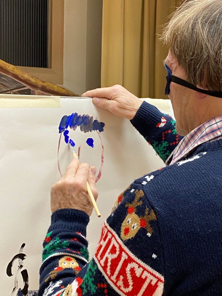
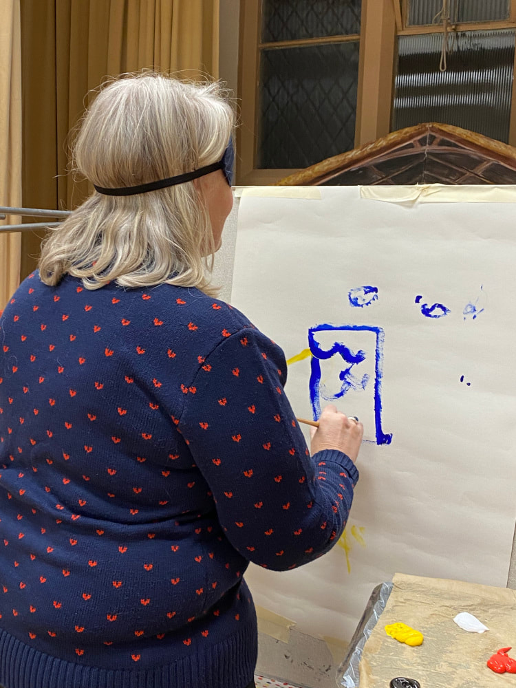
Painting by touch (or guesswork) For some light relief after the voting for our winter art competition concluded, we played a game! Whereas previously we've held a quiz, home-made pictionary, and a beetle drive, this year the game involved picking up a paintbrush. Sounds easy for a bunch of artists? Not so much, especially when wearing a blindfold! The task We divided into two teams, let's call them Team A and Team B. On the stage in the hall were two makeshift easels with a sheet of paper taped to each one. A few feet away from each easel were two tables; on top of each one were paints, paintbrushes, and a small box containing cards. On each card was written the name of a body part - head, eyes, mouth, hair, arm, legs, torso! Yikes! The task for each team was to paint a picture of actor, Daniel Craig. Daniel, in the unlikely event that you ever hear about our game, we can only apologise for our renditions! Each team member took a turn to step up to the table, take a card from the small box containing the name of a body part, and paint it on the sheet of paper. Blindfolded. As you'd expect, this turned out to be hilarious. And the end results look absolutely nothing like Daniel Craig at all. Look at the pictures below and judge for yourself. Our thanks to Joy Tickell and Kay Smith for organising this, and for guiding us up to the boards to do our worst. We had a lot of fun! Christmas meal for members As part of our year end activities we got together for a Christmas meal at La Flambe, in Sutton Benger, and all agreed it was a great evening - consisting of excellent food, excellent company, and a lot of laughs. A big thank you to Tracy Warne from us all for organising the event so well.  And finally, we wish you all a peaceful Christmas and happy New Year. LAG meetings resume for members on Thursday 4 January, 2024. And announcing the visitors’ vote winner Our last exhibition of 2023, held over the weekend of 18-19 November, saw a steady flow of visitors, even though Lacock seemed quieter than usual for the time of year. Members of LAG contributed artwork in oils, acrylics, and watercolours, in different styles and a range of subjects, which visitors said they appreciated. Sales of original artwork, prints and greeting cards totalled a pleasing amount of almost £1,100, thanks to visitors who kindly bought 12 paintings, two prints and 105 cards. The total sales value was a couple of hundred pounds less than the amount raised from the 2022 November exhibition when almost twice as many paintings were sold, whereas card sales levels were similar.
Thanks to all our members for working together to help set up the exhibition and taking it all down on the Sunday afternoon, ensuring a smooth and speedy operation at the start and finish.
The visitors’ winner Visitors again took part in our exhibition in their own way, by voting for their favourite painting on display. This time 57 of our paintings were voted for, and a total of 81 votes were cast. A different take on the famous painting ‘The Scream’ by Edmund Munch emerged as the visitors’ clear winner. Scream 2, painted by Ken Baldy (who always brings some humour into his art) in his inimitable style, received a total of eight votes putting it in first place. It’s fair to say that Scream 2 caused much amusement among many of the visitors over the weekend!  Scream 2 by Ken Baldy, winner of the visitors' favourite painting vote. Four other paintings received three votes each, and nine paintings received two votes each, while 43 paintings each received one vote. Congratulations to Ken whose prize was a bottle of wine. Finally, in 2024 we’ll be holding exhibitions in May, August, and November and will publish the dates on our events page during December. We’d like to thank everyone who took the trouble to come to our exhibitions this year and we hope to see many of you again next year.
Bringing feelings and emotions into painting Stoney Parsons is a contemporary, semi-abstract landscape artist who, by her own admission, tends to live a little dangerously when she paints. Although she starts with a subject idea in mind she never quite knows what will come out on canvas because she often paints scenes from memory, as this helps to keep her painting loose and free. Crucially, she paints what she sees, feels and her reaction to it, which makes the outcome unpredictable. Having been a professional stained glass artist for 35 years her love of decorative art remains dear to her so she always looks to put some of her design effects from stained glass into her paintings. This demo to members and guests of Lacock Art Group in October gave a unique, delightful insight into Stoney’s approach and process to achieve abstraction. This centres on trying to bring her thoughts (conscious and unconscious), feelings and a spiritual sense of the subject into her work, evoking a feeling of space in the landscape she’s portraying. For the demo she painted in acrylics and used a few of her own photos for reference, as a security blanket, she says. Stoney says she also paints a lot in watercolour and in oils, which she thinks are wonderful to work with. Semi-abstract painting is about reduction, finding ways to paint landscape that’s simple but also complex at the same time, Stoney explains. You can find out much more about her work on her website. Stoney was happy to answer questions from the audience. “What’s the inspiration for this painting?” asks one of our members. “I don’t know yet, is the honest answer,” she says. Equipment improvisation Stoney uses a professional series of acrylic paints, often using a limited palette. She tends to use a lot of white, plus Nickel Azo Yellow, Carbon Black, Burnt Umber, and Viridian. Blues include Manganese Blue Hue, Phthalocyanine Blue, and Prussian Blue Hue.
For a palette she uses a metal dinner tray lined with grease proof paper. Amongst her regular kit is a roll of blue paper towel, the Scott brand, which is more expensive than others but more robust and behaves more like a rag than paper. It takes paint off but doesn’t leave a texture on the painting. She is a fan of rubber paint brushes and often works with them. The art materials website, Artesaver, sells a range of these. Stoney also uses a silicone pastry brush. In fact, she has an eclectic assortment of art equipment including many DIY decorating tools as well as cutlery, for example a dinner fork and a wallpaper smoother (at least, I think that's what it was)! “The B&Q painter!” she joked. She also tends to use long brushes, an influence from oil painting. More usual tools include a credit card, a spray water bottle, and a hair dryer. Techniques demonstrated Surface-wise, for the demo Stoney used a plywood board sealed with a gloss medium and painted all over with Jesso and white acrylic paint. She starts by painting clouds and the sky, mixing one of the blue paints with white. With watercolours if you want white in your painting you don’t put paint on the area to be white and you get into the habit of doing that, she says, so she tends to use this approach even when using acrylics.
,Next, she moves onto paint the hills and ground in the middle distance of the scene, in a pale green colours, in sweeping brush strokes. She takes another question from the audience: “What stops you from doing the same stroke each time?” “You have to add differences, different strokes, in different directions, to keep it fresh and interesting,” she explains, as she moves on to paint the foreground that includes an expanse of water. As she works at times, in places on the painting, she takes the entire paper roll and rolls it over the wet paint, to remove paint slightly or to smudge it.
Evoking calm, living dangerously Stoney asks the audience what her painting evokes for them. For a couple of us it reminds us of special places where we’ve walked, or been on holiday, and overall we collectively agree that her painting imbues a sense of calm in us. We realise this isn’t surprising when she tells us how she has painted for hospital patients in the past so had to create art with a peaceful, harmonious feeling to it, responding to the patients’ brief and what they needed - calm, air, and a sense of space. Back to the painting. Stoney works on the foreground by adding bold dark green paint, and sprays it with water making it drip down the board. Impressively, they look like pine trees. Stepping back to look at the painting she decides the bright green trees are too bold and sets about resolving this. You can sand down the surface to soften and mute the colours, or you can blend them. Blending colours with acrylics is harder than blending oil paints because they dry faster, sometimes before achieving a very gradual gradation.
She decides she needs to get depth into the painting, and uses tape to do this. Using a set square to position it she sticks a line of tape down the middle of the group of trees, then applies white paint along the edge of the tape before peeling it off. She rubs off some of the paint from the trees to the right of the tape with paper towel. This gives a blurry effect. This, says Stoney, is a scary moment because you don’t know what the result will be. But you have to get out of your comfort zone, she adds, you have to live dangerously, and live life to the full. Otherwise you get stuck doing the same thing over and over again and don’t grow. A maxim for life in general!
She uses the tape technique once more on the left hand section of the painting, producing the effect of a shaft of light stretching from sky to ground. It works! The tricky thing is to make it look loose and random, abstract but to do it with control. She says she’s naturally a very tight painter so constantly works to be looser, which is not easy.
It’s important to paint sustainably, by which she means find out what you like to do and do that, so that you continue to enjoy your art and don’t get fed up. Stoney says she didn’t know what she was going to paint at the demo, it just took shape and came out as the evening progressed. As you can see from the photos, the end result is a beautiful landscape painting.
 Engrossed! Our thanks to Stoney for delivering a fascinating, thought-provoking demonstration that was also a great deal of fun.
As well as giving painting demonstrations to groups like ours, Stoney also holds classes titled “Towards Abstraction”, which are aimed at those who want to bring a more contemporary feel to their art. The next one is on 22 January, 2024, at her studio in Wiltshire, which you can book via her website. Thanks also go to everyone who attended and to Lynn Pick, one of our members, who was our photographer for the night. Techniques for painting landscapes Our second, and final, day-long weekend workshop for Lacock Art Group members this year was given by professional artist, Paul Weaver, with a focus on teaching how to paint landscapes in watercolour. He delivered an incredibly informative session that everyone enjoyed and each of us went away having learnt something new. Paul is a well-known artist whose primary inspirations are light and atmospheric effects and landscapes are among his favourite subjects. He runs art workshops at various locations including at the White Horse Bookshop in Marlborough, which are always popular. A visit to Paul's website to find out more about his work is highly recommended. Workshop participants came with differing degrees of affection for and experience in watercolour; for some it’s their medium of choice, while several others usually work in acrylics, oils or pastels and hadn’t used watercolours for a long time. Nevertheless, everyone approached the workshop with an enthusiastic spirit and willingness to have a good go. Paul’s first tip was to encourage us to adopt a ‘laboratory’ approach to watercolour painting. Try things out and experiment; don’t be frightened of putting paint on paper. If it doesn’t work, it doesn’t matter, the important thing is that you learn by doing it. This resonated with several of us, including the author of this article who usually spends far too much time dithering before actually daring to apply paint! Start with a tonal value sketch Paul explains that capturing light in a painting is the key to success, and to do this you need to assess the tonal contrast (or tonal values) of the scene. As well as using a reference photo he suggests taking notes about the light at the scene you’re painting, because a photo doesn’t convey colours correctly, especially when taken in bright sunlight. He usually does a tonal sketch first, to make friends with the scene and tap into it. A tonal sketch can be abstract and doesn’t need to be perfect, he says; it’s an indication of the dark and light areas, and shadows. Scruffy is fine! First developing a tonal sketch is an approach often recommended by other artists and can help you decide whether or not a scene is going to work as a painting. For the tonal sketch he roughly draws the outlines, distance, middle distance and foreground, to decide the design, then puts in tone and shadows. With complex paintings Paul says he spends more time on the design and drawing than on painting.
Warming up As a warm up exercise he showed us how to produce a one colour painting, which we then had a go at - a winter tree and field scene with shadows. Using a single colour, in this case burnt sienna, helps to focus on tone and contrast, instead of colour, which often preoccupies artists. His advice is to connect with the subject first, before you paint. Do this by thinking about tone and the subject’s edges. This also informs the best type of paper to use: if the subject edges are sharp or jagged use dry paper, and if foggy and soft use wet paper. Avoid damp paper, which can cause cauliflowers! We used rough watercolour paper at the workshop.
The fundamental concept of watercolours is of diluting the paint to make it lighter or darker, he says. Learn to paint by playing around to make the paint behave so that you know what it’s going to do – this removes the fear factor! Brush tips included using the point of the brush for straight lines, and the flat side for broken areas, called scufffing. The dry brush technique actually requires the brush to be quite wet with paint. Tone - work from background to foreground, and from light to dark. The sky is the lightest. He first wetted the whole sheet before painting the sky and distant part of the fields using a large round brush, size 20. It’s important to paint everything on the wash not in sections in one go, working quickly, so the paint blends together, coalescing softly rather than in stripy chunks. Next he shows how to approach the middle-distance trees, using the side of the brush to achieve the effect of branches. To get light into the painting and the idea of sun coming through trees he lifts out paint in long, sweeping lines giving the impression of shafts of sunlight. Key ingredients for a landscape painting Next we learnt about the essential ingredients, or components, needed to form a landscape painting, such as techniques to approach skies, clouds, trees, water and so forth. To demonstrate, Paul paints a sky, with a large tree, river, reflections, and foreground. 
 Simplifying perspective Bringing it all together Having produced our tonal pencil sketches, a one colour painting to warm up and learnt a number of techniques for painting various elements in a landscape, it was time to bring it all together in a resolved painting. We chose what we wanted to paint from a selection of photo print outs, some involved buildings set in a landscape, others of hills, fields, trees, and rivers. Several reference photos were of different snow scenes so we asked Paul to show us how to paint snow. He demonstrated how to bring the elements together in a complete painting. Adding extra challenge for him, his reference photo was of a summer landscape scene, which called for expert improvisation to turn it into a winter snow scene!
Snow is quite reflective of sky so take this into account when painting. As before, he starts with the sky, first wetting the paper. With a large brush, using strokes that slant downwards from the top right corner, he applies Raw Sienna to represent winter sunshine. Working quickly, he adds Alizarin Crimson, and then French Ultramarine. Alizarin stops the blue going green when it hits the yellow paint, he explains. For the large trees in the distance he works from the outer edges of the branches towards the inner branches, using the side of a dry brush. He mixes a grey made from Light Red, French Ultramarine and Raw Sienna for the trees and horizon line, strengthening it for definition on the building that helps to bring it forwards. To create the snow shadows he mixes French Ultramarine with Alizarin Crimson to make purple, painting loosely and freely. He uses Viridian Green for the fir tree, he again uses a dry brush on its side and broken paint to let some sky peep through the branches. Mixing Viridian with Burnt Umber creates a dark green. He wets some of the branch edges to soften the appearance and blend it into the background. The trunk of the fir tree he paints in a dark brown colour; a mix of French Ultramarine and Burnt Umber. He emphasises the importance of connecting the tree trunk with the shadow at the base of the tree, while paint is still wet, so that the trunk melts into the shadow and becomes one with the snow. For the path edges he uses Burnt Umber with any blue and paints on top of the shadow area. The end result was a great painting!
It was our turn next to produce a complete painting, using the various techniques we had learnt earlier in the workshop, and with Paul there to give a guiding hand to each of us. To see how we got on, please take a look at the Paul Weaver workshop gallery page where you’ll find a range of photos from the day.
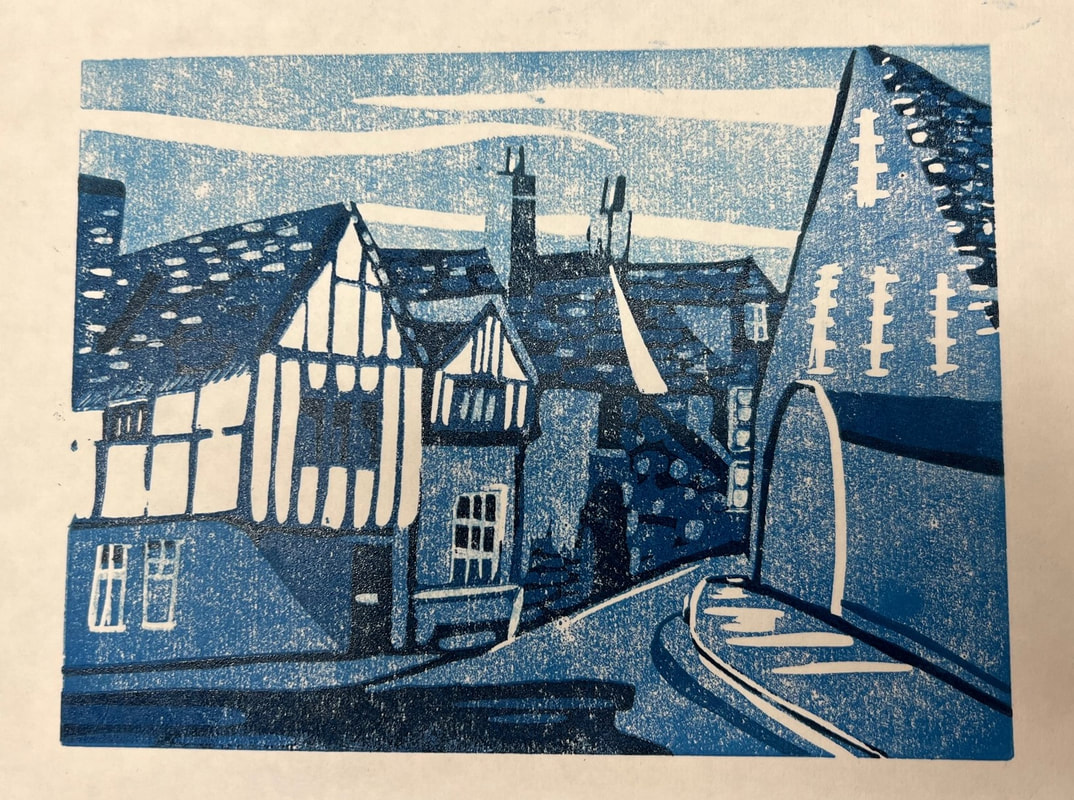
With special thanks to Karen Road and Jane Tucker for photography. Contemporary, semi-abstract landscape painter Demo date: Thursday 19 October, 2023 Time: 7pm prompt. Please arrive 10-15 minutes early so that the demo can start on time. Venue: Lacock Village Hall, Lacock, Wiltshire SN15 2LF Stoney will be demonstrating her approach to painting landscapes in acrylics, and may include mixed media. She has been a professional stained glass artist which has influenced her work in the areas of colour, design and light. An example of Stoney's work is shown here and you can find out more about her style on her website. We welcome the attendance of guests; a £5 entry fee is payable on the door. There is no charge to LAG members.  The Fields Go by Stoney Parsons Featuring the reduction technique Somerset-based artist, Lisa Takahashi, is probably best known for her bold, geometric linocut prints of cyclists, although she also works in watercolour and oils. In the past she has exhibited at the Royal Academy Summer Exhibition and in 2018 reached the semi-finals of the Sky Arts Landscape Artist of the Year. Lisa is an artist in demand so Lacock Art Group members felt very lucky to watch a demonstration by her at one of our Thursday evening meetings in September. Lisa reintroduced many of us to the techniques involved in this special art form, which is something most of us hadn’t tried since our school days!
Lisa has been making linocut prints for about 10 years, developing her own blocky, simplified style. Initially the subject of racing cyclists fascinated and preoccupied her – proving to be very popular with the public – but after virtually exhausting all aspects of the topic she has since diversified. Favourite subjects at the moment are the sea and boats. Invented in 1845, lino (linoleum) is made of solidified linseed oil and sawdust applied to a canvas backing, making it a natural material. Its inherent durability meant it was very versatile for use in high traffic areas, and was often utilised on the floors of naval battleships. Artists of the time quickly recognised that it would make an excellent medium to cut into. The rest, as the saying goes, is history. Techniques and tools There are four main techniques for making linocut prints in more than one colour and for our demo Lisa decided to show us the ‘reduction’ method that she said Picasso invented by Picasso when he was in his 80s –impressive in itself. He’s known to have often used this process for making bullfighting posters. The reduction, or reductive, technique uses one lino tile into which each layer of colour is carved. The tile is printed in a colour after layer is cut, building up the colours in subsequent layers to create depth, definition and contrast. At each layer more lino is removed from the tile’s surface, hence its name, making it quite a challenge and focus is key. The more you cut away the more difficult the process becomes. You need to pay attention and, in common with creating other forms of art, it is very therapeutic. This also means you can’t go back and reprint another time because the block is destroyed, but one edition can run to about 100 prints before the lino tile quality degrades and starts to crack. Multi-block linocut is an alternate method, in which more than one lino tile is used to make a print. Often, each colour is printed onto a separate lino tile to build layers. Although this method means you can return to print again nevertheless it can be hard to align the different layers accurately. Lisa tends to use a few specialist tools for her craft - lino angled tools, which are very sharp - working with four shapes of tool. You don’t need different depth of cuts as in wood carving so most people can manage with only a few tools. Lisa used standard lino with a depth of 3.2mm. It’s possible to use the kind of lino sold by carpet/flooring shops (called Marmoleum) but the surface can be quite waxy so the paint is harder to print. She uses a trusty old toothbrush to scrape away ‘crumbs’ of lino from crevices after cutting it. For smaller prints she uses special Japanese paper called HoSho, which is thin but strong. Lisa prefers to use oil paints for her linocut prints, adding a medium (Druck-Medium) to make it sticky and transfer paint to paper effectively, mixing them on a piece of Perspex palette.
Painting approach By pure coincidence, or serendipity, Lisa chose a photo of a house in Lacock as the subject of her demo print. She usually starts by outlining the shape of the image on the lino tile with an Indian ink pen. The image on the lino tile is the mirror of the picture being recreated. Once the drawing is complete she begins cutting into the outline with the tool, being careful to keep her hands behind the blade to avoid cutting yourself – safety is paramount. A golden safety rule is to rotate the block not the tool. Lisa typically works from light to dark colours, in a similar way to watercolours. She decided to make the street scene for the demo in shades of blue using a mix of Prussian blue and white for the sky. She added Paynes grey to the blue to make a darker blue where necessary. Using a registration corner made from mount board she lines up the first print for printing, then presses the paper with a round bamboo Japanese tool called a baren to transfer paint to paper. When sufficient layers are printed, clean the block and cut more lino away to make the next layer. Use a tiny amount of Gamsol, similar to white spirit, to remove paint residues from the block. ‘Chatter’ marks are random lines that appear when ink is accidentally picked up on the wrong (carved away) parts of lino and leaves unplanned, random and unexpected marks. Sometimes this creates added charm, other times it gets in the way. At our demo Lisa for the last layer of colour Lisa cut away details such as little drop shadows, reinforcing lines where they were needed, window frames on the houses, bricks and so on. The resulting print was brilliant, as you can see in the photos. Our thanks to Lisa for giving such an interesting, warm and informative demo. It was well-attended by members and guests, who all enjoyed it enormously and Lisa may well have inspired a few of us to try linocut printing again.
Thanks to Lynn Pick for being our 'official' photographer for the demo.
 Calling all local artists Art exhibition registration deadline looms A firm fixture in Wiltshire's annual cultural calendar, the 49th Calne Music and Arts Festival (CMAF) is gearing up to open for business on 6 October, offering a comprehensive and wide-ranging programme of activities to suit different tastes and ages. Central to the programme is an open art exhibition that runs in Marden House for the duration of the Festival, 7-14 October, presenting the works of predominantly local artists, professional, semi-professional and amateur, who are based in Calne and surrounding Wiltshire towns/villages. The majority of artworks exhibited will be for sale. The standard of exhibits is typically very high so, if previous exhibitions are anything to go by, this year the standard is sure to be equally impressive. Participation in the exhibition is genuinely ‘open’ with work only refused if it does not meet the entry criteria. Several LAG members have taken part in previous CMAF exhibitions. Key exhibition dates and links If you’re interested in exhibiting this year, you will need to register online by 5pm on Thursday 28 September, using the form on the CMAF website. This link takes you to the form. Alternatively you can print the form, complete it and take it with you on the artwork submission day – this is likely to take longer than using the online option. Artists can submit up to three works each, for an entry fee of £5 per piece. You can find detailed information about entry criteria, terms and conditions in the online form. Artwork hand-in day is Saturday 30 September, between 10am and 2pm, at Marden House. Other art-related Festival events As well as the exhibition the programme includes a number of art events, including:
You can view the full programme here on the CMAF website where you can also buy tickets. A year on, royalty through the lens of LAG member Ken Baldy  Elizabeth II, painted in 2022 by Ken Baldy Today, 8 September, 2023 is a significant date. It marks the first anniversary of our late Queen's passing. Elizabeth II reigned for over 70 years, making her the longest reigning monarch in British history. Over the years, her enduring, deep sense of duty and devotion to service won the respect of many in the UK and Commonwealth, including some who were not royal supporters. Elizabeth II was also known for her sense of humour and quick wit, which revealed her human side, and admired for her dignity and strength of character. You could say that Elizabeth II was a British monarch of a kind like never before. One of our members, Ken Baldy, enjoys painting portraits of the late Queen and other members of the Royal Family, producing several in his unique, inimitable style. She would surely have appreciated them. They are always popular at our exhibitions. Here are a few of them, as an affectionate tribute to Elizabeth II on the first anniversary of her death.  Elizabeth II, to mark her 70th birthday - by Ken Baldy  Elizabeth II and Duke of Edinburgh looking into the light, painted by Ken Baldy Please note: the copyright to these images is owned by Ken Baldy
Successful August bank holiday exhibition for LAG Our most recent exhibition and art sale took place over the three days of the August bank holiday weekend; a regular spot in our events calendar each year. Held as usual in Lacock Village Hall, the exhibition often benefits from the additional footfall that the National Trust village attracts from late-summer visitors on a day out, and this year was no exception. There was also some healthy competition for us on bank holiday Monday from a few stalls set up outside the Red Lion pub (often frequented after our weekly art group meetings by some of our members), including one or two stalls selling various types of art. Somewhat mixed weather throughout the weekend didn't seem to deter visitors to Lacock with a steady stream of people calling in to look at the art on display at our exhibition, which was good to see. Our August exhibition tends to generate higher sales compared to our February and November exhibitions, partly driven by the additional day. This proved to be the case this August. In total 41 paintings were sold during the course of the weekend, 35 were original works hung and displayed on boards, and six were unframed works from the browsers. As ever, greeting cards proved popular with 99 sold in total, 42 of which were Kay Smith's handiwork! This resulted in achieving total sales of just over £2,500. LAG members John Harris and Joy Tickell each sold five of their paintings, and a few others sold four each including Karen Road and Richard Newsome.
Visitors keep on voting We are continuing to invite visitors who look around our exhibitions to take part in our 'visitor vote' by submitting the name of their favourite painting on display. This informal competition is just a bit of fun, and we really appreciate people taking the time and effort to take part. A total of 257 votes were cast during the August exhibition and 99 paintings received one vote or more. This time, the winner of the visitor vote is . . . Kay Smith and her painting of a ballerina, featured on the poster for the August exhibition, which received nine votes. Congratulations to Kay, who won a bottle of wine. This is something of a hat trick for Kay, being the third time one of her paintings has won the visitor vote.
Finally
Thanks to all of our members who helped to set up/take down the exhibition boards, supported the event by stewarding, and for producing such a variety of fantastic art for people to enjoy. The biggest thank you of all goes to the lovely, friendly people who visited our exhibition and showed such appreciation for our art. Our next exhibition is in November - please check the events page on this site for details. |
WelcomeRead about our latest activities and initiatives here! Archives
February 2025
Categories
All
|
- Home
-
Galleries
- Workshops >
- Challenges >
-
Members' Galleries
>
- Richard Adams
- Ken Baldy
- Keith Bennet
- Graham Brewster
- Victoria Cleverly
- Sarah Clover
- Dave Cooper
- Chris Crosby
- Margaret Gray
- John Harris
- Jacqui Matthews
- Vanda McCann
- Graeme McFaull
- Karen McGreevy
- Glyn Overton
- Sally Parsons
- Linda Ridler
- Karen Road
- Kay Smith
- Joy Tickell
- Jane Tucker
- Elspeth Wales
- Tracy Warne aka Maggie
- Angela Weir Martin
- Mike Wilson
- Exhibitions
- News/Blog
- Membership
- Events
- Contact


 RSS Feed
Site powered by Weebly. Managed by netnerd.com