|
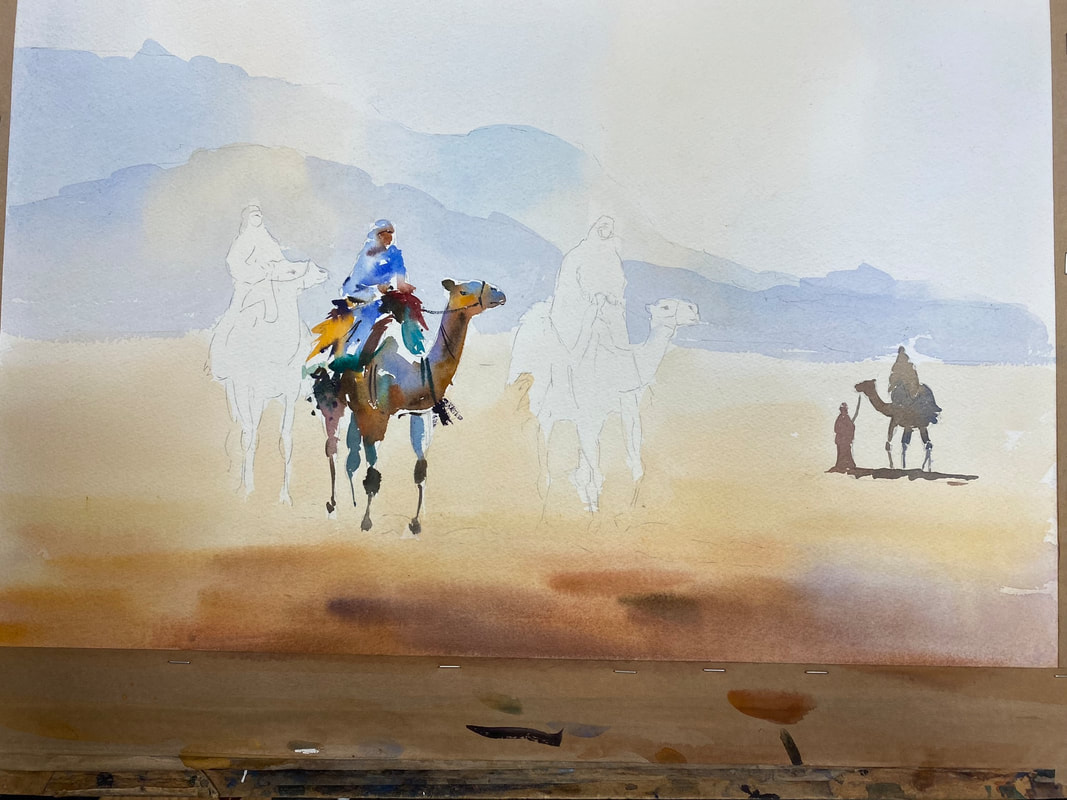
Painting subject: camel train Following an art demonstration that Jake Winkle gave to Lacock Art Group last year we were keen for him to return to run an all-day watercolour workshop and secured the date of Saturday 25 Jan for exactly that. Our all-day workshops are reserved only for members of Lacock Art Group, with places offered on a first come/first served basis due to space limitations. All 16 places were taken quickly, making it a full house. Workshop materials Jake’s go-to watercolour paper is Arches rough,140lbs, which he prefers to use because it offers good absorbency and dries evenly. However, a good quality watercolour paper like Arches is expensive so it’s worthwhile shopping around various art supply websites in search of the best price. You can often find it on special offer. He advises stretching the paper first, to avoid cockling (bending) when it gets very wet and to help prevent the paint from puddling and/or creating cauliflowers. Jake’s tried and tested method for stretching paper is to put a sheet of in a bath tub of water and let it soak for one minute. Then remove the paper and leave it for 5-10 minutes to expand and then dry. When it’s ready to use, fix the sheet of paper to a board using gum tape (not the self-adhesive paper tape for sealing the reverse of picture frames) on all four sides. You could also use masking tape but this tends to become loose and peel off if it gets too wet. Palettes, paints and brushes
Workshop Jake explained that the aim of this workshop was to achieve a light touch, loose, simple style. By simple he means no details, impressionistic. The subject is a desert scene of a camel train, with hills in the distant background. As the focus of the workshop was on painting rather than drawing, to save time, he provided us with a template of the drawing to trace onto our own paper. At every step in the process Jake demonstrated the technique to attendees before letting us loose on the painting. Then while we got on with it, he walked around to each person to see how they were doing, offering advice and answering questions along the way, which was really helpful. Sky and foreground - initial wash He asked us to wet the paper with water first using a large brush - buying time to put the wash on, Jake assures us. Having already mixed up a pool of pale, watery cobalt blue we applied it at the top of the paper in long, light strokes, alternating the blue patches with a watery, yellowy orange colour (raw sienna or yellow ochre). We took this variegated wash down to the bottom of the mountain range.
With the paper still damp, we move on to the sand, starting at the bottom and working quickly, wet into wet, putting the orange colour on first (using light red or similar, with raw sienna/yellow ochre) making the wash paler and yellow as it moves up towards the base of the mountains. While it’s still wet, go in with a stronger, more intense orange/brown col in the foreground, darkening it with ultramarine blue and splashes of purple if we liked. Ensure that the top colour is stickier in consistency than the colour of the layer below it. Mountains Jake guides us through putting a slightly stronger wash of cobalt blue on the far distant hill again alternating with orange/yellow to create the sun’s glow, stopping just above the top line of the second, mid-distant mountain. The initial wash had to be dry before applying the next layer. A slightly darker cobalt blue with a tiny dab of alizarin crimson goes on this second mountain, as well as the orange/yellow colour. Camels The smallest camel on the right of the painting is a silhouette, using a neutral, darkish colour (such as sepia, or ultramarine blue and burnt sienna). Next the focus is on the middle camel in the main group of three, painting the rider first. Jake shows us how to approach this, by using fragmented brush strokes – breaking up the marks and leaving parts of the paper white. The approach also suggests detail using gestures (e.g. riders’ hands and faces, using sticky light red), and encourages us not to copy the colours of the reference photo but to try to use other colours like blues, yellows, purples.
We use cobalt blue, orange and yellow or red for the camel’s body and a neutral blue grey colour on the legs. Jake urges us to leave gaps between the camel’s leg joints rather than paint the legs with one continuous brush stroke as this adds interest. Using a similar approach we then paint the camel on the far left before tackling the one on the far right of the group, completing the trio.
To finish off Jake showed us how to paint the shadows of the camels, which helps to ground the animals in the painting. He makes a sticky mix of cobalt blue, light red or alizarin crimson and paints in the shadow, which falls in a left to right direction. The last word Everyone attending Jake’s workshop thoroughly enjoyed themselves. It was highly informative, good-humoured, and everyone pitched in regardless of their experience with watercolour. Massive thanks to Jake for his patience on the day, and for showing us a range of techniques that we can take forwards into our future paintings. To see the paintings produced by attendees during the workshop please go to the 2025 Jake Winkle workshop gallery. Thank you for reading.
0 Comments
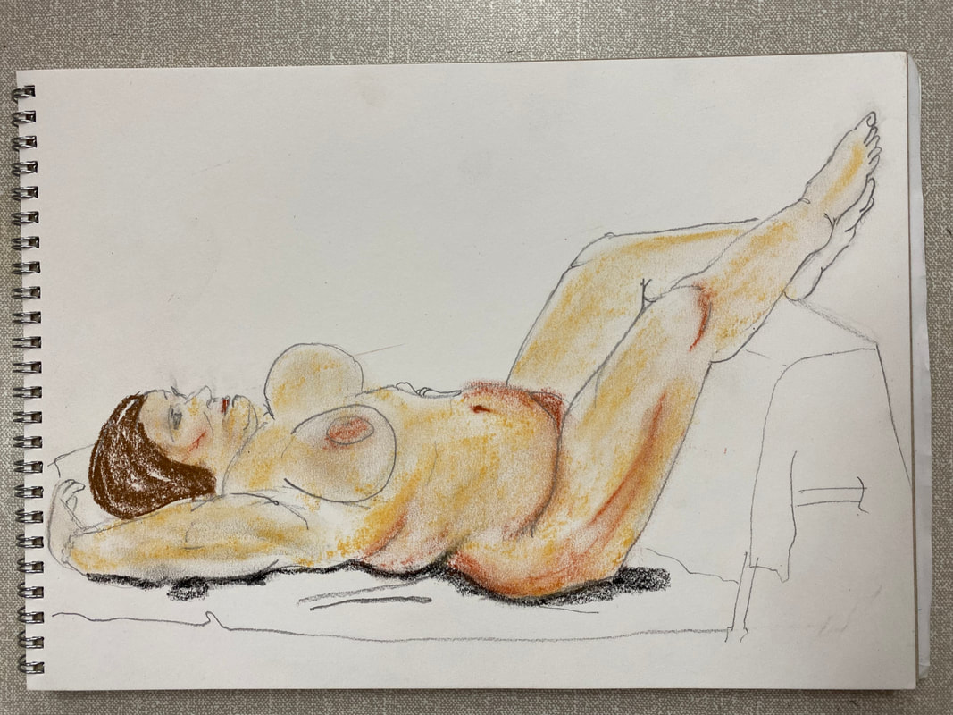
A summary of the art produced during this special session Occasionally we hold life drawing sessions for our member artists to take part in if they wish, with the latest one held towards the end of July. Experienced life drawing model, Loz, sat for a variety of timed poses: 5 x 2 minute poses; 2 x 5 mins; 2 x 10 mins; 1 x 15 mins; and 1 x 25 mins. Loz was brilliant, holding a range of poses, standing, seated, and lying down. The high speed sketches were a particular challenge to draw, causing the brains of one or two of us to freeze in sheer panic at the prospect! It was hugely enjoyable, highly intense, and a valuable exercise. Here are a selection of our drawings. On behalf of everyone who took part in this session, we extend our thanks to Loz for her professionalism and patience. 5 and 10 minute poses
15 min poses
25 min pose
An introduction to oil painting by Melissa Wishart One Saturday in mid-February, 17 of our members took part in a day-long workshop all about oil painting, delivered by well-known Wiltshire artist, Melissa Wishart. These workshops are exclusively for Lacock Art Group members and it’s great to have expert artists/tutors like Melissa giving us their undivided attention to help us learn and improve our art. Melissa’s workshop was the first one featuring the use of oils. Several attendees have considerable experience of painting with oils while others’ experience of the medium is limited to non-existent, so a few of us approached the day with some trepidation! We needn’t have worried; Melissa pitched the tone perfectly for all levels of experience, with good humour, knowledge, and a relaxed, guiding hand. To find out more about Melissa’s art and background please visit her website. In addition to this blog post about the workshop, please take a look at the Oils Workshop gallery page to see more images from the day.
First steps and fundamentals Melissa started us off on the fundamentals of oil paint, and surface; paint brands to use, canvas vs boards, and went on to talk about dilutants (to thin the paint), and techniques like glazing (transparent layers of paint that reflect light). Other tips include:
Exercise 1 – palette preparation and colour mixing Melissa explained that with oils, the bulk of the work of a painting happens on the palette, through colour mixing, and recapped on warm and cool colours (warm = red, orange, yellow, cold = green, blue, magenta). Our first task was to lay out a palette, putting large blobs of paint around the edge of the palette in a circle, following the colour wheel sequence: Titanium White, Lemon Yellow (for brighter greens), Cadmium Yellow Deep, Yellow Ochre, Cadmium Red, Burnt Sienna, Ultramarine Blue (aka French Ultramarine), Burnt Umber, and Cerulean Blue. Using a palette knife (not a brush), in the middle of the palette we mixed a large amount of grey, either from Ultramarine, Burnt Umber and White, or from black and white. This grey, which Melissa calls her ‘mothership’, forms the basis of all mid-tones. We then put blobs of grey around the palette and mixed them with a spot of each colour to mute them. A palette knife is easier for mixing as you can simply wipe it clean with a rag. It’s important not to contaminate different colours on the brush because you tend to end up with muddy colours.
Composition essentials Having sorted out our palettes ready for action, the workshop moved to the topic of composition. Careful planning here is key – this applies to all drawing/painting not just oil painting, of course. We would be painting a landscape or a seascape during the workshop, a scene of our own choice. Melissa suggested using a viewfinder to select the section of the reference picture that interests you most. For a painting to be successful it’s crucial for the artist to have an emotional connection with the subject matter. Our tutor guided us through a number of decisions that need making, in particular:
Exercise 2 – composition thumbnails We each brought a couple of reference photos with us to the workshop to base our paintings on. To help us decide on our compositions, Melissa tasked us with drawing four quick thumbnail sketches of our scene to explore and experiment with different compositions. Decide on the view that works best for you, that piques your interest and engages you, she said. Is it better portrait or landscape? What should you leave out of the composition? Where are the light and dark areas?
Mark making Having settled on a preferred composition, we then got to work with the paints. Melissa asked us to bring along two canvasses, or boards, suitable for use with oils, about A3 in size, and primed with a ground of burnt sienna acrylic paint. On the first canvas Melissa asked us to sketch the main lines of our painting with a brush. Next we applied an initial layer of paint to block in the different colours of the main areas, using a palette knife or a silicone wedge to spread the paint on. The wedge allows large areas of the canvas to be covered quickly. We continued to build up our paintings, adding more colour, trying different strokes, blending colours as we painted, and gradually adding more detail. Melissa encouraged us to use the second canvas to experiment with applying paint thickly – this is known as ‘pasto’. It produces different textures to the painting, adds variety and depth. It’s also useful practice for those who usually use watercolours or pastels, which have a uniform texture. One or two of us, however, tried this out on our first canvas! She also suggested we try out different techniques to vary the type of marks made on the canvas.
   Summing up Everyone thought the workshop went incredibly fast, which is always a good sign. We all had a great time and learnt a lot, thanks to Melissa’s calm guidance and expertise. She remarked that our group was full of energy, enthusiasm and had a keen willingness to get stuck in. Some of us even surprised ourselves with the paintings we produced on the day! Plus, there may even be a few oils converts among us. With grateful thanks to Melissa for sharing her knowledge with us, and apologies for forgetting to include her in one of our results photos - mainly due to the mayhem involved in herding people into groups!  Finally, if you'd like to see Melissa's work she is exhibiting with Maxine Harraway in Bath at the Pop Up Art Studio Gallery in Milsom Place from 22 March to 7 April, 2024. For those who'd like to take their oil painting further with Melissa she's holding a two day summer school in Bradford-on-Avon on 30-31 May, 2024. Information is available on her website.
Techniques for painting landscapes Our second, and final, day-long weekend workshop for Lacock Art Group members this year was given by professional artist, Paul Weaver, with a focus on teaching how to paint landscapes in watercolour. He delivered an incredibly informative session that everyone enjoyed and each of us went away having learnt something new. Paul is a well-known artist whose primary inspirations are light and atmospheric effects and landscapes are among his favourite subjects. He runs art workshops at various locations including at the White Horse Bookshop in Marlborough, which are always popular. A visit to Paul's website to find out more about his work is highly recommended. Workshop participants came with differing degrees of affection for and experience in watercolour; for some it’s their medium of choice, while several others usually work in acrylics, oils or pastels and hadn’t used watercolours for a long time. Nevertheless, everyone approached the workshop with an enthusiastic spirit and willingness to have a good go. Paul’s first tip was to encourage us to adopt a ‘laboratory’ approach to watercolour painting. Try things out and experiment; don’t be frightened of putting paint on paper. If it doesn’t work, it doesn’t matter, the important thing is that you learn by doing it. This resonated with several of us, including the author of this article who usually spends far too much time dithering before actually daring to apply paint! Start with a tonal value sketch Paul explains that capturing light in a painting is the key to success, and to do this you need to assess the tonal contrast (or tonal values) of the scene. As well as using a reference photo he suggests taking notes about the light at the scene you’re painting, because a photo doesn’t convey colours correctly, especially when taken in bright sunlight. He usually does a tonal sketch first, to make friends with the scene and tap into it. A tonal sketch can be abstract and doesn’t need to be perfect, he says; it’s an indication of the dark and light areas, and shadows. Scruffy is fine! First developing a tonal sketch is an approach often recommended by other artists and can help you decide whether or not a scene is going to work as a painting. For the tonal sketch he roughly draws the outlines, distance, middle distance and foreground, to decide the design, then puts in tone and shadows. With complex paintings Paul says he spends more time on the design and drawing than on painting.
Warming up As a warm up exercise he showed us how to produce a one colour painting, which we then had a go at - a winter tree and field scene with shadows. Using a single colour, in this case burnt sienna, helps to focus on tone and contrast, instead of colour, which often preoccupies artists. His advice is to connect with the subject first, before you paint. Do this by thinking about tone and the subject’s edges. This also informs the best type of paper to use: if the subject edges are sharp or jagged use dry paper, and if foggy and soft use wet paper. Avoid damp paper, which can cause cauliflowers! We used rough watercolour paper at the workshop.
The fundamental concept of watercolours is of diluting the paint to make it lighter or darker, he says. Learn to paint by playing around to make the paint behave so that you know what it’s going to do – this removes the fear factor! Brush tips included using the point of the brush for straight lines, and the flat side for broken areas, called scufffing. The dry brush technique actually requires the brush to be quite wet with paint. Tone - work from background to foreground, and from light to dark. The sky is the lightest. He first wetted the whole sheet before painting the sky and distant part of the fields using a large round brush, size 20. It’s important to paint everything on the wash not in sections in one go, working quickly, so the paint blends together, coalescing softly rather than in stripy chunks. Next he shows how to approach the middle-distance trees, using the side of the brush to achieve the effect of branches. To get light into the painting and the idea of sun coming through trees he lifts out paint in long, sweeping lines giving the impression of shafts of sunlight. Key ingredients for a landscape painting Next we learnt about the essential ingredients, or components, needed to form a landscape painting, such as techniques to approach skies, clouds, trees, water and so forth. To demonstrate, Paul paints a sky, with a large tree, river, reflections, and foreground. 
 Simplifying perspective Bringing it all together Having produced our tonal pencil sketches, a one colour painting to warm up and learnt a number of techniques for painting various elements in a landscape, it was time to bring it all together in a resolved painting. We chose what we wanted to paint from a selection of photo print outs, some involved buildings set in a landscape, others of hills, fields, trees, and rivers. Several reference photos were of different snow scenes so we asked Paul to show us how to paint snow. He demonstrated how to bring the elements together in a complete painting. Adding extra challenge for him, his reference photo was of a summer landscape scene, which called for expert improvisation to turn it into a winter snow scene!
Snow is quite reflective of sky so take this into account when painting. As before, he starts with the sky, first wetting the paper. With a large brush, using strokes that slant downwards from the top right corner, he applies Raw Sienna to represent winter sunshine. Working quickly, he adds Alizarin Crimson, and then French Ultramarine. Alizarin stops the blue going green when it hits the yellow paint, he explains. For the large trees in the distance he works from the outer edges of the branches towards the inner branches, using the side of a dry brush. He mixes a grey made from Light Red, French Ultramarine and Raw Sienna for the trees and horizon line, strengthening it for definition on the building that helps to bring it forwards. To create the snow shadows he mixes French Ultramarine with Alizarin Crimson to make purple, painting loosely and freely. He uses Viridian Green for the fir tree, he again uses a dry brush on its side and broken paint to let some sky peep through the branches. Mixing Viridian with Burnt Umber creates a dark green. He wets some of the branch edges to soften the appearance and blend it into the background. The trunk of the fir tree he paints in a dark brown colour; a mix of French Ultramarine and Burnt Umber. He emphasises the importance of connecting the tree trunk with the shadow at the base of the tree, while paint is still wet, so that the trunk melts into the shadow and becomes one with the snow. For the path edges he uses Burnt Umber with any blue and paints on top of the shadow area. The end result was a great painting!
It was our turn next to produce a complete painting, using the various techniques we had learnt earlier in the workshop, and with Paul there to give a guiding hand to each of us. To see how we got on, please take a look at the Paul Weaver workshop gallery page where you’ll find a range of photos from the day.
With special thanks to Karen Road and Jane Tucker for photography. Elizabeth Baldin September workshop - spaces available
Lawrence Art Society (LAS) is repeating a successful workshop in watercolours and acrylic ink by Elizabeth Baldin and opening up the few places remaining to artists outside of LAS. Workshop date: Wednesday 27th September 2023 Venue: Bishops Cannings village hall, near Devizes Timing: 10am - 3pm The workshop will use watercolour/acrylic inks and is titled ‘Free-flowing Florals' (sunflowers or peonies) - a loose approach to painting flowers". Depending on attendance numbers the cost of the workshop is £30 - £35 for the session. To discover more about Elizabeth's work please take a look at her website. Elizabeth trained in graphic design and worked as a designer for a major book publisher for several years, before starting her own design business, and is now a full-time artist. If you'd like a place on the workshop please email Margaret Hanson of Lawrence Art Society at [email protected] to register your interest. One cold Saturday in January professional artist, Jamel Akib, delivered a workshop for LAG members featuring four different subjects, each to be painted in acrylics or oils, in the style Jamel is known for – confident, deft, bold, brush strokes, blocks of bright colour, and an economic approach. It may have been chilly outside, yet the atmosphere and mood inside Lacock Village Hall, where we held the workshop, was very warm, relaxed and good humoured. Holding a four to five hour long workshop on a weekend is a different type of activity for LAG members, the aim being to offer more variety and the chance to try out new techniques under the guidance of professional artists. Landscape – St Agnes Jamel started us off with an ‘easy’ landscape; a photo of St Agnes in Cornwall with hillside tin mines and bay in the distance, contrast turned up high making the vast expanse of heather sloping down to the foreground burst into a riot of purples, pinks and oranges.
He showed us the step-by-step process for painting this scene. Starting with a simple outline drawing on a canvas or board pre-prepared with a pink/purple base, he then painted the sky using a mix of Naples yellow and white, turquoise with white for the sea, and burnt sienna for the buildings. Jamel painted the heather with a wide, flat brush, using long, vertical strokes to apply blocks of colour – amethyst, oranges and yellows – and permanent rose for the path. He continued to build up the layers of paint, adding shadows and highlights to the buildings, and depth to the heather. Then we all had a go! Photos on the workshop gallery page show how Jamel approached this and you can also see some of the paintings we produced on the day. A few of us generally paint with watercolours and have little or no experience of acrylics so we felt out of our comfort zone. Nevertheless, it was good to try something completely different for a change. To attempt four paintings in four and a bit hours meant the pace of work had to be super-speedy! This was too ambitious for some so several of us opted to do two or three paintings during the session, rather than the full set. Feathered friends - owl and hummingbird Next up was to paint an owl and a hummingbird. Again Jamel took us through how to approach these subjects in a step-by-step process. This time, however, we didn’t draw the outline of the birds, we went straight in with paint. Jamel blocked out the shape of the owl’s body and head, using pale orange for the neck, darker orange for the body and turquoise on the right of the body to create shadows, adding permanent rose next to the blue for darker shadows. He applied amethyst for wing shadow detail and body feathers, giving it shape. For the face, he used a paler blue with a dab of yellow, and amethyst to suggest the beak, and chin line (do owls have chins?). Amethyst mixed with black were used for the eyes, with a speck of white as a highlight. To finish it off, Jamel painted large brush strokes in amethyst as the background, making the owl merged the body edges into the background.
Jamel used a very similar approach to paint the hummingbird, building the painting up in blocks of colour and applied orange and raw sienna for the head and body and explained the need to use interesting brush strokes. White and yellow were used for highlights, and green with raw sienna for the top of the head. To convey movement, Jamel advised blurring the body strokes into the background colour.
Lion – up close and personal The final subject of the day was a lion’s head or, to be more accurate, it’s face showing an intense gaze. By the time we got to this painting, the end of the workshop was in sight to time was fairly limited. This exercise involved using a paste applied to the surface of the board to create a textured base, spreading it fairly roughly and randomly with a palette knife creating. This textured foundation really helps to produce a realistic effect for the lion’s hair. Jamel used a variety of colours for this painting: raw sienna; burnt sienna; burnt umber; and neutral grey. His finished version was impressive, as you can see from the image.
Jamel’s workshop definitely stretched us, but it was also hugely enjoyable and many of us learnt new techniques to put into practice in the future. You can see the artwork we produced during the workshop on a dedicated gallery here.
To find out more about Jamel’s work, please take a look at his website: https://www.jamelakib.com/index.html |
WelcomeRead about our latest activities and initiatives here! Archives
February 2025
Categories
All
|
- Home
-
Galleries
- Workshops >
- Challenges >
-
Members' Galleries
>
- Richard Adams
- Ken Baldy
- Keith Bennet
- Graham Brewster
- Victoria Cleverly
- Sarah Clover
- Dave Cooper
- Chris Crosby
- Margaret Gray
- John Harris
- Jacqui Matthews
- Vanda McCann
- Graeme McFaull
- Karen McGreevy
- Glyn Overton
- Sally Parsons
- Linda Ridler
- Karen Road
- Kay Smith
- Joy Tickell
- Jane Tucker
- Elspeth Wales
- Tracy Warne aka Maggie
- Angela Weir Martin
- Mike Wilson
- Exhibitions
- News/Blog
- Membership
- Events
- Contact


 RSS Feed
Site powered by Weebly. Managed by netnerd.com