|
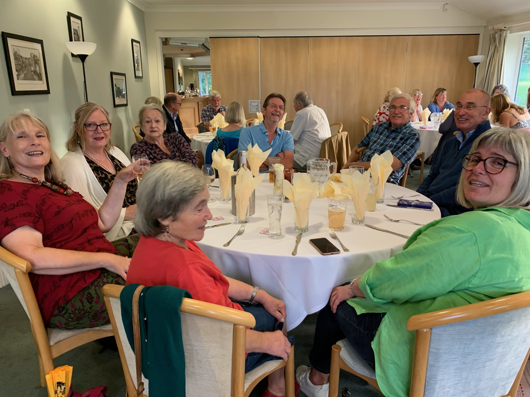
Following last year's introduction of a summer social event for LAG members, this year’s event took place at Chippenham Golf Club on Thursday, 10 August. We hold these events because we're a sociable, friendly bunch at heart who like to get together from time to time without the focus being on our art, and it's also a good use of surplus funds accrued. Committee Member and event organiser extraordinaire, Tracy Warne, did an excellent job and even managed to arrange a warm, sunny evening for the BBQ – one of the few during July and August here in the UK, it has to be said! It was lovely to sit on the terrace, chatting, looking out over the golfing greens, with the last rays of evening sunshine warming our faces, and the unmistakable smoky smell of the BBQ wafting our way. Fortunately most of our members were able to attend, and we missed all those unable to come along. A special mention goes to Ellen Bothwick, whose car broke down on her way to the BBQ. Unfortunately, there was no quick fix for it so, instead of tucking into burgers, sausages, vegetable kebabs and various salads, Ellen spent a couple of hours waiting for roadside rescue to come to her aid, although they didn't arrive in time for her to get to the BBQ.
Raffle winners
Tracy commissioned Lisa Peare to provide the bespoke balloon decoration for the raffle prize table. If anyone is interested in having a similar decoration for a special event you can use our website form to contact her and we’ll pass on your details. Many of our members who attended the event have their own gallery on this website. To view their artwork please follow the links in the lists – the photos are captioned by table number, with names and links to galleries listed underneath. Note, if a name doesn't have a link that person doesn't yet have their own website gallery page.
Table 1a: L-R Karen Road, Jane Tucker, Chris Crosby, Victoria Cleverly Table 1b: L-R Chris Crosby (again), Angie Weir, Kay Smith Table 1c: L-R Sally Parsons, Karen Road (again), Jane Tucker (again), Chris Crosby (again!) Table 2: L-R Ken Baldy, Joy Tickell, Elspeth Wales, Richard Newsome, Keith Bennett Table 3: L-R Anna Swatton, Vanda McCann, Karen McGreevy, Maggie Jenkins, George Jenkins, Richard Adams, Graham Brewster, Sophia Swatton LAG August exhibition – members’ art on show, for sale Artwork created by many of our members will be on display and for sale at our next exhibition over the August bank holiday weekend at Lacock Village Hall. Our exhibition poster below gives the detail – come along if you can; we hope to see you there.  Finally, a gallery reminder for members
If you’re a LAG member and don’t yet have a personal gallery page on our website, please look at our guidance on how to submit gallery images.
0 Comments
Elizabeth Baldin September workshop - spaces available
Lawrence Art Society (LAS) is repeating a successful workshop in watercolours and acrylic ink by Elizabeth Baldin and opening up the few places remaining to artists outside of LAS. Workshop date: Wednesday 27th September 2023 Venue: Bishops Cannings village hall, near Devizes Timing: 10am - 3pm The workshop will use watercolour/acrylic inks and is titled ‘Free-flowing Florals' (sunflowers or peonies) - a loose approach to painting flowers". Depending on attendance numbers the cost of the workshop is £30 - £35 for the session. To discover more about Elizabeth's work please take a look at her website. Elizabeth trained in graphic design and worked as a designer for a major book publisher for several years, before starting her own design business, and is now a full-time artist. If you'd like a place on the workshop please email Margaret Hanson of Lawrence Art Society at [email protected] to register your interest. The practice of making a tonal underpainting in one colour by Joy Tickell The word ‘Grisaille’ comes from the French ‘gris’, for grey, so is literally a grey scale painting. However, this term is used even if the underpainting is done using another colour - often burnt umber. Painting a grisaille allows the artist to focus on the tonal values (degree of light or dark) without the complications of colour. When working in colour it can be easy to misjudge the actual tonal value. An ancient art The concept of Grisaille started hundreds of years ago when pigments were scarce. Old masters used it as a first stage of an oil painting, which was then glazed over to achieve luminosity in their work. Glazing is when transparent layers of paint are used over opaque layers. Rembrandt, amongst others, was a great exponent of this method of working. The light can then travel through the transparent layers and be reflected back from the opaque underlayers of the grisaille giving greater depth of colour. The underpainting was done by covering the white canvas (or other surface) with a slightly diluted paint. The paint is then wiped away in the light areas of the image to reveal the white surface below. A tonal underpainting is then built up by adding white and black to the paint to build up the various tones. One of the best examples of Grisaille in modern art is Picasso’s ‘Guernica’ painting. One of the downsides of using a grisaille is that the final colours may be less vivid. However this can be overcome by using a mixture of glazing techniques as well as using opaque colours to enhance these less vivid areas. Although this method was traditionally used in oil painting it can also be used in acrylic and watercolour. Often a grisaille piece is left as a stand alone artwork, without the addition of colour, and this is known as a classic grisaille. How to approach grisaille I have attempted to show how this method can be used to paint a box of oranges. I am not an expert so please do take time to investigate how experts do it properly!!! I have used oils for my example. Step by step guide In diagram 1 you can see how I have made an initial sketch of the image. In diagram 2 I have made a basic grisaille using burnt umber with black and white to get my tonal underpainting. I could have gone to much more trouble using more tones but as this is only an example I didn’t spend too much time on it.
In diagram 3 I have used glazes of orange on the fruit, french ultramarine on the box and green on the leaves. You can see already how easy it is to bring life to the underpainting. In diagram 4 I have wiped away some of the orange glaze where I want the lightest areas of the image to be.
In diagram 5 I have used a glaze of cadmium yellow over the highlight areas of the oranges. I have also used a glaze of green gold on the leaves and burnt sienna on the wooden crate. I could keep adding layers and add some opaque highlights to really give it some bling.  Diagram 5: coloured glazes added For my glazes I diluted my oil with a little liquin. There are glazing mediums available or you can
research how to make your own by browsing the web. I hope this will inspire you to have a go at this technique. Do send your examples so that we can post them on our website for all to see!! Creating collage Marilyn Allis is a well-known artist who works mainly in water colour, as well as in acrylic inks and mixed media. She has a loose and impressionistic style, using strong vibrant colours to capture movement, and the energy of a scene. We are very pleased that Marilyn is soon to deliver a demonstration for our art group. Marilyn won the SAA artist of the year title in 1999 and appeared on Channel 4’s Watercolour Challenge TV series. Her demonstration for Lacock Art Group next month focuses on collage techniques, similar to those Marilyn used to produce the artwork shown here of the late Queen Elizabeth II, so it promises to be an interesting and interesting evening. To find out more about Marilyn’s work please take a look at her website. Guests are welcome to attend, with a £5 fee payable on the night at the door. When: Thursday 4 May, 7pm. Please arrive 10-15 minutes beforehand so that the demonstration can start on time. Where: Lacock Village Hall. We look forward to seeing you at the demonstration.  Collage of Queen Elizabeth II by Marilyn Allis Coming soon - our first exhibition this year is on 15 to 16 April Everyone's welcome, including well-behaved dogs out for a walk with their owners! Please drop in if you're in Lacock - details are below - we'd love to see you.   Informative and inspirational A recent demonstration by Phil Madley that introduced our members and guests to encaustic wax proved to be an inspiring treat as well as a tonic. Phil has a background in design and graphics and originally got into encaustic wax after visiting a craft fair years ago where he bought a starter kit. Warmly witty throughout, Phil talked about the kit needed to work with encaustic wax and 'waxed lyrical' about the importance of using the right kit when you start out and then experiment with alternatives once you’ve mastered the essentials. Getting started A basic kit consists of a small iron, hot stylus, hot air gun, a range of attachments such as mini iron, circles, squares, rectangles, plus a scriber, kitchen paper, and a duster. Phil buys his wax from Wakes Waxes which offers 48 different coloured waxes, each costing about £1.40 per stick (price is correct at the time of publication). Sometimes people are tempted to heat up standard wax crayons or candles instead of using specialist wax, but when that type of wax is cold it loses elasticity and becomes rigid. If the card it’s used on bends, the brittle wax will break and your artwork ruined. He advises utilising a special coated card with a shiny surface when using encaustic wax, which doesn’t absorb the hot wax. You can also use board and MDF too. Prepare the MDF with a coating of gesso to create a surface barrier preventing the hot wax from penetrating the material. Ensure you set the iron to the right (low) temperature when you start off; iron temperatures vary from one to another so some trial and error is to be expected until you find the optimum temperature for your equipment.
Mark making Apply the cold wax to the warm plate of the iron, by rubbing the stick of wax onto it, similar to the way you’d use pastels. Bear in mind that the lighter the colour of the wax the runnier it is when put on the surface of the card. So, the wax is warm and ready to go, what next? Phil showed us how to first convey the wax by ‘ironing’ it onto a piece of card. While the wax was warm and manoeuvrable, he then started to make patterns in the wet wax with the iron. He used the edge (side) of the ironing plate to make straight marks/lines in the wax, creating flower petals (as in the image at the top of this post), and more abstract designs by working the iron back and forth producing Spirograph style patterns. Phil made this technique look easy, which is a testament to his excellent skills, as are the art that he creates using encaustic wax.
Using the the pointed tip of the iron produces dots to represent the stamens in a flower, while the attachments make marks such as small circles or triangles to represent whatever you like! The scriber tool can be used to scrape away wax as another method of making marks. When happy with the pattern created, you can use kitchen paper to polish the picture, or to tone down the colour. This produces a glossy finish, and the picture can also be buffed with a duster. It was inspirational to see the colourful beauty of the art that Phil achieves using encaustic wax and since the demo at least one of our members has had a go it! Our thanks to Phil for opening our eyes to the art of the possible, and keeping us all engaged in a different, informative and entertaining demonstration. To find out more about Phil Madley and his art please take a look at his website here.  Landscape in wax A new logo for LAG
When we launched this website in November 2021 we did so using a temporary logo, with a plan to replace it soon afterwards with an official logo. For various reasons, however, deciding what our logo would be has taken longer than anticipated. Until now! We encouraged our members to be involved in choosing our new logo. So, instead of holding our usual end-of-year painting competition for members in 2022 the Committee decided to hold an informal competition to design a new logo. Entries were displayed at our Christmas Frolics event last December and everyone who attended voted for their preferred design – the entry receiving the most votes would be the winner. Fast forward to today: we're pleased to unveil our new logo, which from now on we’ll be using on all our art group promotional materials. The winning entry, by Elspeth Wales, was judged to have best met the brief of being clean, clear, simple, contemporary, and conveys who we are/what we do at a glance. We hope you like it too. On behalf of the Committee, thanks go to everyone in LAG who took the time and effort to design and submit a logo entry; especially as this type of graphic design is different to what most of our members are familiar with. Demo diary date: Thursday 30 March At the end of March we are putting on a demo with a difference. Instead of featuring watercolours, oils or acrylics, this demo is all about making art with encaustic wax. Phil Madley, a talented, contemporary artist who works with encaustic wax to create stunning, original, unique paintings, will take the audience through his approach. Encaustic wax is an ancient method of painting, using heated wax, often painted onto firm yet absorbent surfaces, such as wood. Take a look at Phil's website to find out more about his art and technique. To learn more about the history of encaustic wax and using it to paint with, there's an interesting article on Jackson's Art Supplies website.
What to expect Phil will produce several paintings in wax during the demo, and pass them round for people to look at. He works with an iron, hot stylus, hot air gun, scriber, to name a few tools. He’ll also bring paintings along to the demo to show the audience and he promises the session will be fun, informative and quite a bit different! Phil works on a flat table, rather than an easel, which means that the audience usually gathers around the table so they can see what he’s doing. Therefore, we will use a camera and projector, which will be set up above the table, looking directly down at the work surface, to ensure everyone has a good view of what's going on. Timings Arrive no later than 6.45pm for a 7pm prompt start. Further details are available on the events page of our website, where you can also find out about forthcoming events organised by Lacock Art Group. Guests welcome This demo is open to guests and visitors for an entry price of £5 per person, payable at the door on the night. Please come along and join us.  Images using in this blog are provided by Phil Madley; he owns their copyright.
Featuring the work of South-West artists Max Hale and Paul Weaver Well-known local artists Max Hale and Paul Weaver are holding their spring exhibition – Creative Journeys – at the Tetbury Goods Shed Art Centre from 29 March to 7 May 2023 (Wednesdays to Sundays). At Lacock Art Group we’re always happy to support local artists so encourage you to visit their exhibition and tell friends and family about it if you think they may be interested. Further details are shown below. Both are excellent artists; Max works in watercolours, oils, acrylics, and pastels while Paul specialises in watercolour presently and also works in oils, acrylics, and line and wash. To find out more about the artists and their work please explore their websites using these links: https://www.maxhaleart.co.uk/ and https://www.paulweaverart.co.uk/  One cold Saturday in January professional artist, Jamel Akib, delivered a workshop for LAG members featuring four different subjects, each to be painted in acrylics or oils, in the style Jamel is known for – confident, deft, bold, brush strokes, blocks of bright colour, and an economic approach. It may have been chilly outside, yet the atmosphere and mood inside Lacock Village Hall, where we held the workshop, was very warm, relaxed and good humoured. Holding a four to five hour long workshop on a weekend is a different type of activity for LAG members, the aim being to offer more variety and the chance to try out new techniques under the guidance of professional artists. Landscape – St Agnes Jamel started us off with an ‘easy’ landscape; a photo of St Agnes in Cornwall with hillside tin mines and bay in the distance, contrast turned up high making the vast expanse of heather sloping down to the foreground burst into a riot of purples, pinks and oranges.
He showed us the step-by-step process for painting this scene. Starting with a simple outline drawing on a canvas or board pre-prepared with a pink/purple base, he then painted the sky using a mix of Naples yellow and white, turquoise with white for the sea, and burnt sienna for the buildings. Jamel painted the heather with a wide, flat brush, using long, vertical strokes to apply blocks of colour – amethyst, oranges and yellows – and permanent rose for the path. He continued to build up the layers of paint, adding shadows and highlights to the buildings, and depth to the heather. Then we all had a go! Photos on the workshop gallery page show how Jamel approached this and you can also see some of the paintings we produced on the day. A few of us generally paint with watercolours and have little or no experience of acrylics so we felt out of our comfort zone. Nevertheless, it was good to try something completely different for a change. To attempt four paintings in four and a bit hours meant the pace of work had to be super-speedy! This was too ambitious for some so several of us opted to do two or three paintings during the session, rather than the full set. Feathered friends - owl and hummingbird Next up was to paint an owl and a hummingbird. Again Jamel took us through how to approach these subjects in a step-by-step process. This time, however, we didn’t draw the outline of the birds, we went straight in with paint. Jamel blocked out the shape of the owl’s body and head, using pale orange for the neck, darker orange for the body and turquoise on the right of the body to create shadows, adding permanent rose next to the blue for darker shadows. He applied amethyst for wing shadow detail and body feathers, giving it shape. For the face, he used a paler blue with a dab of yellow, and amethyst to suggest the beak, and chin line (do owls have chins?). Amethyst mixed with black were used for the eyes, with a speck of white as a highlight. To finish it off, Jamel painted large brush strokes in amethyst as the background, making the owl merged the body edges into the background.
Jamel used a very similar approach to paint the hummingbird, building the painting up in blocks of colour and applied orange and raw sienna for the head and body and explained the need to use interesting brush strokes. White and yellow were used for highlights, and green with raw sienna for the top of the head. To convey movement, Jamel advised blurring the body strokes into the background colour.
Lion – up close and personal The final subject of the day was a lion’s head or, to be more accurate, it’s face showing an intense gaze. By the time we got to this painting, the end of the workshop was in sight to time was fairly limited. This exercise involved using a paste applied to the surface of the board to create a textured base, spreading it fairly roughly and randomly with a palette knife creating. This textured foundation really helps to produce a realistic effect for the lion’s hair. Jamel used a variety of colours for this painting: raw sienna; burnt sienna; burnt umber; and neutral grey. His finished version was impressive, as you can see from the image.
Jamel’s workshop definitely stretched us, but it was also hugely enjoyable and many of us learnt new techniques to put into practice in the future. You can see the artwork we produced during the workshop on a dedicated gallery here.
To find out more about Jamel’s work, please take a look at his website: https://www.jamelakib.com/index.html |
WelcomeRead about our latest activities and initiatives here! Archives
February 2025
Categories
All
|
- Home
-
Galleries
- Workshops >
- Challenges >
-
Members' Galleries
>
- Richard Adams
- Ken Baldy
- Keith Bennet
- Graham Brewster
- Victoria Cleverly
- Sarah Clover
- Dave Cooper
- Chris Crosby
- Margaret Gray
- John Harris
- Jacqui Matthews
- Vanda McCann
- Graeme McFaull
- Karen McGreevy
- Glyn Overton
- Sally Parsons
- Linda Ridler
- Karen Road
- Kay Smith
- Joy Tickell
- Jane Tucker
- Elspeth Wales
- Tracy Warne aka Maggie
- Angela Weir Martin
- Mike Wilson
- Exhibitions
- News/Blog
- Membership
- Events
- Contact


 RSS Feed
Site powered by Weebly. Managed by netnerd.com